
Ch.27: The ROC Curve and AUC
Inspired by: YouTube
Every metric so far in this arc, accuracy, precision, recall, F1 (Ch.25, Ch.26), scores a model at one fixed decision point. This post covers the ROC curve and AUC, which step back and ask a different question: how good is this model across every possible decision point at once?
1. Classifiers Don't Actually Output Labels
A classification algorithm, Logistic Regression, a Decision Tree, an SVM, whatever, doesn't directly hand back "spam" or "not spam." Internally, it computes a probability, a number between 0 and 1, that's how confident the model is that a given row belongs to the positive class. A threshold then turns that probability into a label: by default, 0.5, anything at or above it gets called positive, anything below gets called negative.
That default of 0.5 is just a convention, not a law. And which threshold is "correct" turns out to depend entirely on the problem, exactly the kind of judgment call Ch.26 ran into with precision and recall.
2. Threshold Selection Is a Cost/Benefit Trade-Off
Take the spam classifier again. Say a placement offer email, with instructions to show up for onboarding on a specific date, gets wrongly flagged as spam. That's far more costly than an actual spam email slipping into the inbox, which is just a mild annoyance. In Ch.26's terms, the false positive is the dangerous error here.
One way to cut down on false positives: raise the threshold. Instead of calling anything above 0.5 spam, require 0.75, or even 0.9, before the model commits to that label. Fewer emails clear that higher bar, so fewer real emails get wrongly caught, at the cost of letting more actual spam through uncaught (more false negatives). Threshold selection is a dial, turning it trades one error type for the other.
The catch: there's no way to know in advance which threshold value is the right one. Is 0.5 correct? 0.65? 0.85? Nothing about the model itself says so, it has to be worked out. That's the problem the ROC curve exists to solve.
3. Two New Quantities: TPR and FPR
Building on the confusion matrix's four cells from Ch.25, two ratios matter here:
TPR is exactly recall from Ch.26: of everything actually positive, what fraction got correctly caught. Think of TPR as the benefit, it's the entire reason the model was built, to catch real positives, so higher is always better. FPR is new: of everything actually negative, what fraction got wrongly caught anyway. Think of FPR as the cost, every false positive is a real negative case disturbed for nothing, so lower is always better.
Every threshold value produces its own confusion matrix, and therefore its own (TPR, FPR) pair. The ideal spot is TPR (catch every real positive) and FPR (disturb zero real negatives), the top-left corner of a unit square. No real model sits exactly there, but the goal is to get as close to that corner as the data allows.
4. Building the Curve
Sweep the threshold across every value from 0 to 1, recompute TPR and FPR at each one, and plot TPR (y-axis) against FPR (x-axis). That plot is the ROC curve (Receiver Operating Characteristic, a name from its original signal-detection context that's safe to forget immediately, everyone just says "ROC").
It's tempting to assume TPR and FPR move together in a straight line, raise the threshold, both drop by roughly the same amount. That's a common misconception, and it's wrong. Near a very low threshold, the model calls almost everything positive: both TPR and FPR sit near 1. Raising the threshold slightly first clears out the negatives that were furthest from being positive, emails the model was never seriously confident about, so FPR drops fast while TPR barely moves (the genuinely spam emails still clear the new, slightly higher bar). Only once the threshold climbs into the range where genuine positives actually live does TPR start dropping too. TPR and FPR fall at different rates depending on where the threshold currently sits, which is exactly why the curve bows away from a straight diagonal line instead of following one.
5. Picking the Best Threshold
With the full curve traced out, the best operating point is whichever one sits closest to that ideal top-left corner, the point that best balances benefit against cost simultaneously.
from sklearn.linear_model import LogisticRegression
from sklearn.metrics import roc_curve
import numpy as np

lor = LogisticRegression()
lor.fit(X_train, y_train)
y_probs = lor.predict_proba(X_test)[:, 1]

fpr, tpr, thresholds = roc_curve(y_test, y_probs)
distance_to_corner = np.sqrt((1 - tpr)**2 + fpr**2)
best_threshold = thresholds[np.argmin(distance_to_corner)]
roc_curve returns the FPR, TPR, and the exact threshold value at every point along the curve, in one call, rather than looping over thresholds by hand. Running this on the Pima Indians diabetes dataset (patient measurements predicting diabetes, the same kind of dataset the video uses):
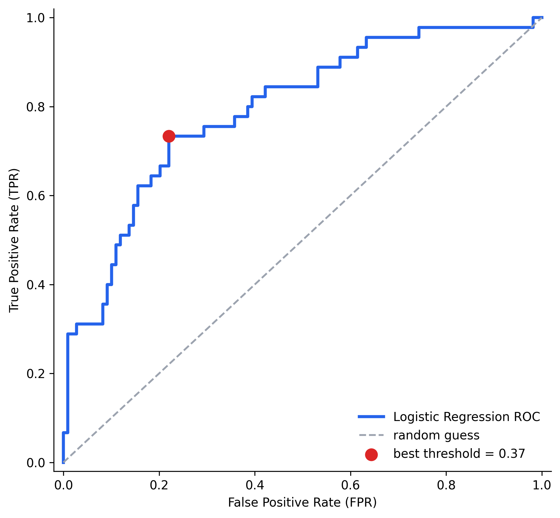
The closest point to the top-left corner lands at a threshold of 0.37, not the default 0.5, with TPR and FPR . Note this is a Logistic Regression model, so 0.37 is picked by geometry here, balancing TPR and FPR equally; if false positives were known to be the costlier error for this particular problem, that same curve would instead be searched for the point with the lowest FPR the model can manage while keeping TPR still acceptable, not necessarily the corner-closest point.
6. AUC: One Number for the Whole Curve
The ROC curve itself is a full picture, but comparing two models by staring at two overlapping curves is awkward. AUC, the Area Under the (ROC) Curve, condenses the entire curve into a single number: literally the 2D area between the curve and the x-axis, over the full 0 to 1 range on both axes.
- AUC : a perfect classifier, some threshold perfectly separates every positive from every negative, and the curve hugs the top-left corner completely.
- AUC : the curve sits exactly on the diagonal, no better than random guessing.
- AUC : a perfectly backwards classifier, it labels every positive as negative and every negative as positive.
Higher AUC means better classification performance, averaged across every possible threshold. That's what makes it useful for comparing two entirely different models without committing to any one threshold at all:
from sklearn.svm import SVC
from sklearn.metrics import roc_auc_score, roc_curve

svm = SVC(probability=True)
svm.fit(X_train_scaled, y_train)
y_probs_svm = svm.predict_proba(X_test_scaled)[:, 1]

print(roc_auc_score(y_test, y_probs))       # Logistic Regression
print(roc_auc_score(y_test, y_probs_svm))   # SVM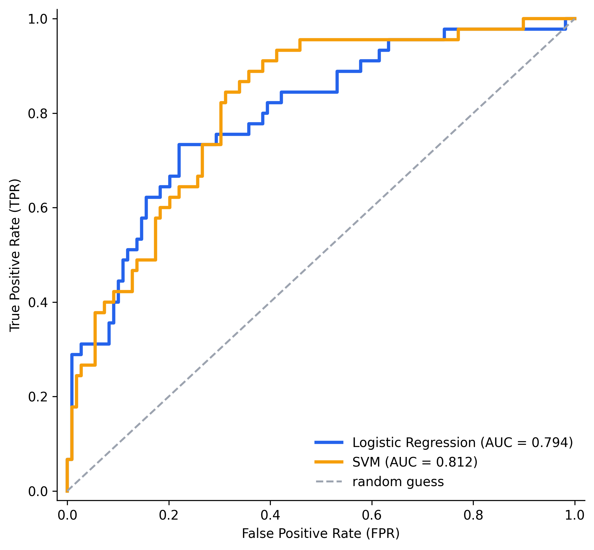
SVM comes out ahead here, AUC against Logistic Regression's , visible directly in the plot too: the orange SVM curve sits consistently a little closer to the top-left corner through the middle of the range. That's a threshold-independent verdict on which model classifies better overall, exactly the second use case for the ROC curve: not just picking a threshold for one model, but ranking multiple models against each other.
(There's no CampusX companion notebook for this particular video, its usual numbered-day folders jump from day 60 straight to day 65, so the code above follows scikit-learn's standard roc_curve / roc_auc_score workflow directly rather than a specific source notebook. SVM's decision boundary is scale-sensitive, so both models here are trained on standardized features for a fair comparison.)
7. Where This Leaves the Classification Metrics Arc
Accuracy, precision, recall, and F1 all answer "how good is this model at this one threshold?" The ROC curve and AUC answer a different question: "how good is this model across every threshold there is?" Both questions matter, threshold-specific metrics for deploying a model with a concrete decision rule, and AUC for judging or comparing a model's raw discriminative power before a threshold is even chosen.