
Ch.40: PCA in Practice - MNIST, Visualization, and Where It Breaks Down
Inspired by: YouTube
The last post worked out the full math of PCA by hand: covariance matrices, eigenvectors, eigenvalues, and a manual pipeline on a small 3-feature dataset. Nobody actually writes that pipeline by hand in practice, sklearn's PCA does it in a couple of lines. This post uses that real implementation on a genuinely high-dimensional dataset, uses it to visualize what dimensionality reduction actually buys you, and then closes the series with the question every PCA writeup eventually has to answer: when does this technique just not work?
The Dataset: MNIST
This is the actual MNIST dataset: 60,000 handwritten digit images (0-9), each 28x28 pixels, flattened into 784 columns, one column per pixel. That's a 784-dimensional space for something a human recognizes instantly by eye. It's exactly the kind of dataset PCA is built for: lots of columns, most of them redundant (neighboring pixels are highly correlated, since a stroke of ink covers many pixels at once, not just one). This code ran as a Kaggle notebook against the real 60k-row CSV, not a downsized stand-in.
import pandas as pd
from sklearn.preprocessing import StandardScaler
from sklearn.model_selection import train_test_split

df = pd.read_csv("mnist_train.csv")   # 60000 rows x 785 columns
y = df["label"].values
X = df.drop(columns=["label"]).values.astype(float)

X_train, X_test, y_train, y_test = train_test_split(
    X, y, test_size=0.2, random_state=42
)

scaler = StandardScaler()
X_train_s = scaler.fit_transform(X_train)
X_test_s = scaler.transform(X_test)
Baseline: KNN on the Raw 784 Columns
Before touching PCA, it helps to have a number to compare against. A plain k-nearest-neighbors classifier does a brute-force distance calculation against every training point, which gets expensive fast at 784 dimensions and tens of thousands of rows, so the accuracy/timing comparison below runs on an 8,000-row training subsample and a 2,000-row test subsample of the real data (the PCA fit itself, and the explained-variance curve, still use the full 48,000-row training set):
from sklearn.neighbors import KNeighborsClassifier
from sklearn.metrics import accuracy_score
import numpy as np
import time

rng = np.random.default_rng(23)
train_idx = rng.choice(len(X_train_s), 8000, replace=False)
test_idx = rng.choice(len(X_test_s), 2000, replace=False)

knn = KNeighborsClassifier()
knn.fit(X_train_s[train_idx], y_train[train_idx])

t0 = time.time()
acc = accuracy_score(y_test[test_idx], knn.predict(X_test_s[test_idx]))
elapsed = time.time() - t0
That comes out to about 91.5% accuracy, using all 784 columns, with prediction taking roughly 0.57s on the subsample.
Applying PCA for Real
from sklearn.decomposition import PCA

pca = PCA()
pca.fit(X_train_s)
Called with no arguments, n_components defaults to the number of input columns, so this produces the full set of 784 principal components rather than reducing anything yet. What's useful right away is explained_variance_ratio_: for each component, what fraction of the total variance in the data it alone accounts for.
import numpy as np

cum_variance = np.cumsum(pca.explained_variance_ratio_)
cum_variance[k] says how much of the original 784-dimensional data's variance is preserved by keeping just the top k + 1 components. Plotting that running total against the number of components gives a clean way to pick a cutoff:
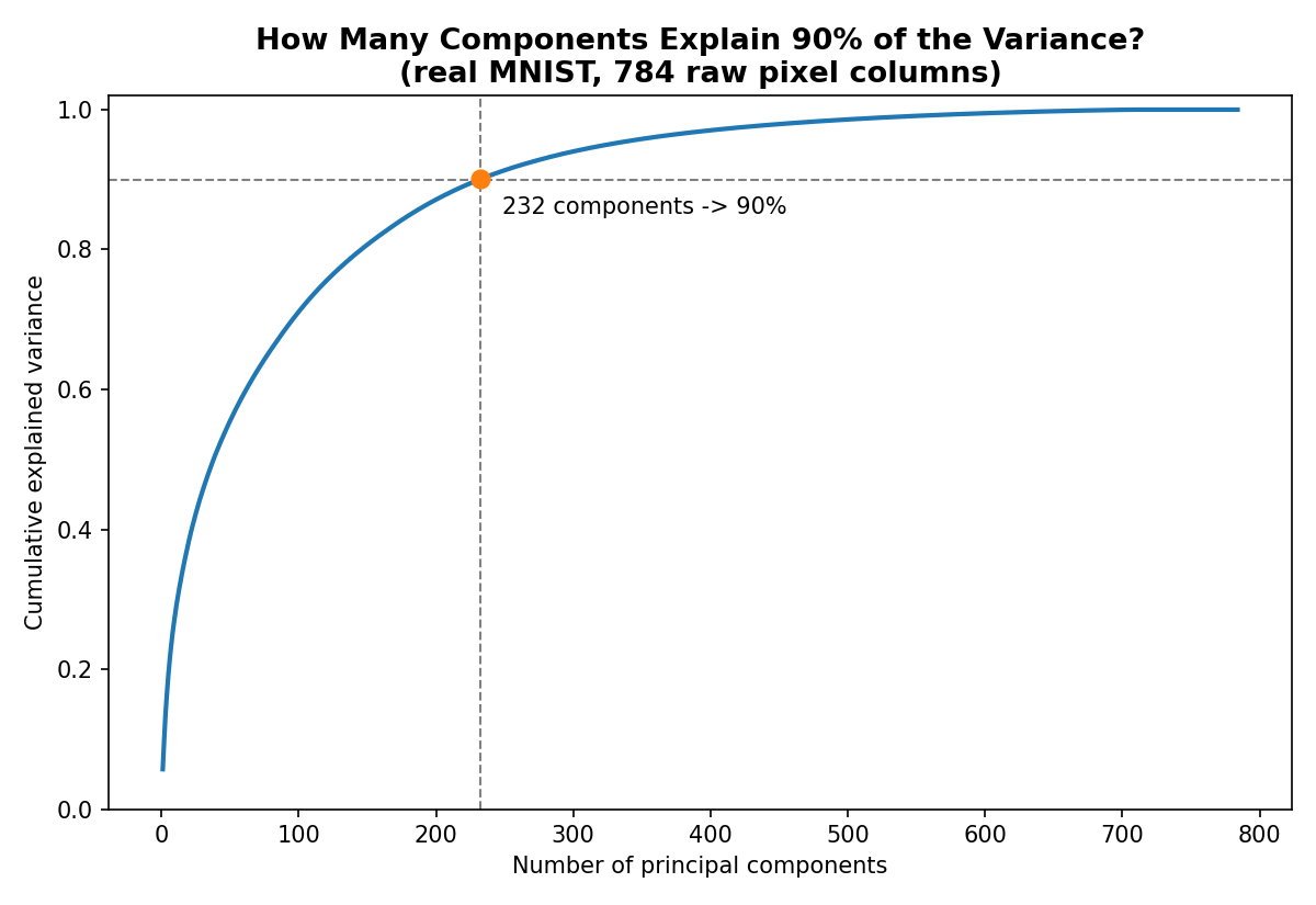
The rule of thumb used throughout the source material: keep adding components until the curve crosses 90% explained variance, then stop. Rather than eyeballing that crossing point off the chart, np.argmax finds it directly, it returns the index of the first True in the boolean array cum_variance >= 0.90:
n_components_90 = np.argmax(cum_variance >= 0.90) + 1Here that happens at 232 components, less than a third of the original 784. (The curve climbs much more slowly than it would on a toy digit dataset, because real handwritten strokes vary across a genuinely large number of independent directions, corner thickness, slant, loop width, stroke pressure, and so on. 90% variance needs 232 components out of 784; 95% needs 325.)
Accuracy After Reduction
pca_reduced = PCA(n_components=232)
X_train_pca = pca_reduced.fit_transform(X_train_s)
X_test_pca = pca_reduced.transform(X_test_s)

knn_pca = KNeighborsClassifier()
knn_pca.fit(X_train_pca[train_idx], y_train[train_idx])
accuracy_score(y_test[test_idx], knn_pca.predict(X_test_pca[test_idx]))
That gives roughly 92.3% accuracy, using 232 columns instead of 784, and prediction drops to about 0.24s on the same subsample, over twice as fast, with accuracy actually slightly higher than the 784-column baseline. That's not a fluke: KNN's distance calculation is sensitive to noisy, low-signal dimensions, and dropping the 552 lowest-variance components removes mostly noise rather than mostly signal. fit finds the components once, transform projects any data (train or test) onto that already-fixed set of axes, exactly the same fit/transform split used by StandardScaler and every other sklearn preprocessor.
Visualizing 784 Dimensions in 2D
The other classic use of PCA, alongside dimensionality reduction for modeling, is dimensionality reduction for the human eye. Nobody can look at a point in 784-dimensional space and build any intuition for it. Reduce it to 2 or 3 components, though, and it becomes an ordinary scatter plot.
pca_2d = PCA(n_components=2)
X_2d = pca_2d.fit_transform(X_train_s)
X_2d is now a plain array of PC1/PC2 pairs, standing in for all 784 original pixel columns. Coloring each point by its true digit label (a random 4,000-point sample of the real training set, plotted for legibility):
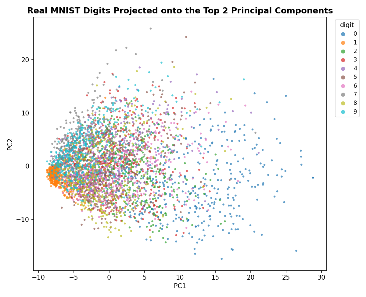
Digit 1 separates almost entirely on its own on the left, a thin vertical stroke lights up very few pixels and barely varies from sample to sample, so it lands in a tight, low-variance corner. Digit 0 fans out the widest on the right, a full loop covers a lot of pixels and its exact size/roundness varies a lot between people's handwriting. Everything else, the digits with moderate ink coverage, overlaps heavily in the middle, exactly what's expected when 784 dimensions get flattened down to just 2. That overlap isn't a bug in PCA, it's an honest picture of how much structure the first 2 of 784 directions can realistically hold onto; the earlier explained-variance curve already said as much, 2 components capture under 10% of the total variance here.
One more component helps untangle some of that middle overlap. Here's the same real MNIST training data (300 samples per digit) projected onto the top 3 components instead of 2, as an interactive plot, drag to rotate, scroll to zoom, and use the digit buttons below to isolate one class at a time:
Where PCA Doesn't Help
Everything so far makes PCA look close to magic: feed in high-dimensional data, get back a lower-dimensional version that keeps almost all the useful structure. That's true often enough to be genuinely useful, but not always. There are data shapes where PCA runs without error and produces components, and those components are still useless. Three of them come up constantly:
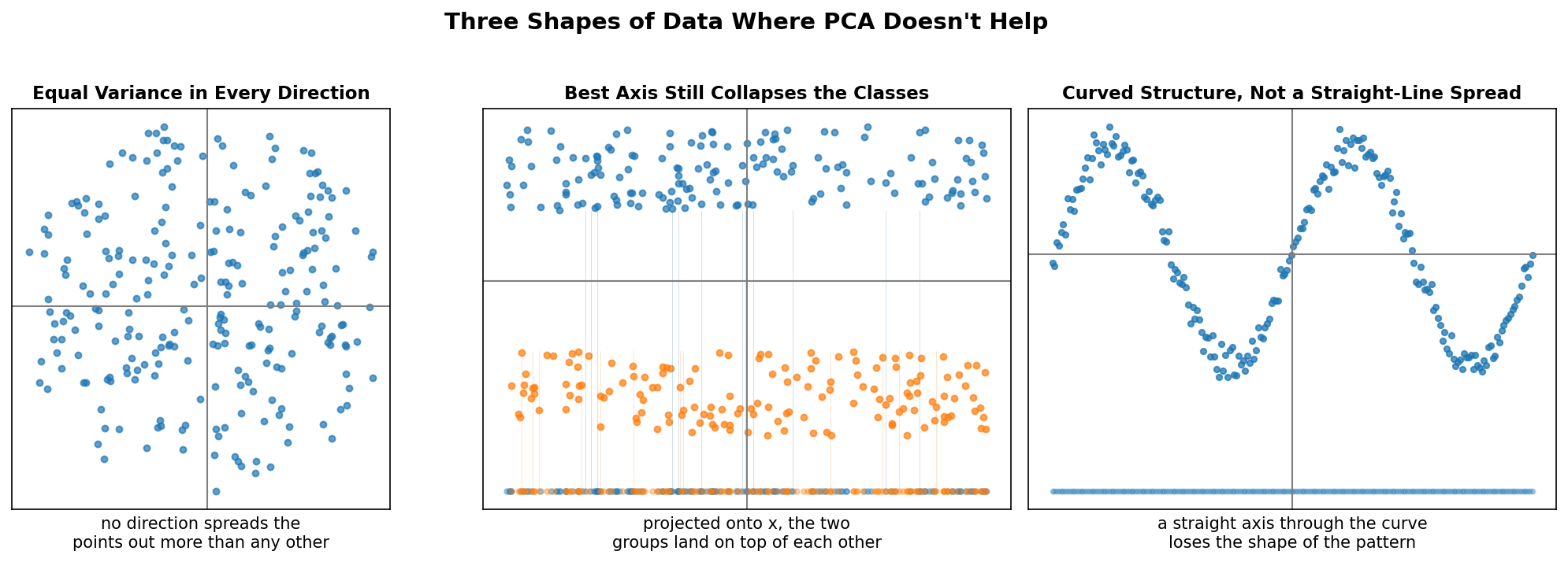
1. Equal variance in every direction. PCA's whole premise is finding the direction of maximum variance. If the data is a roughly circular (or spherical) blob, spread is identical in every direction by construction. Rotate the candidate axis anywhere and the projected variance barely changes, there's no "best" direction to find, because none exists. Running PCA on data like this still returns components, but they're arbitrary, not meaningful.
2. Classes that overlap along the only axis that matters. Sometimes different classes are cleanly separated in the original space, but only along an axis PCA doesn't end up choosing, or the classes overlap along every axis that does have high variance. In the middle panel, the two groups are visually distinct as bands, but projected onto the x-axis (the axis with the most spread) they land on top of each other. Whatever separated them is lost the moment they're flattened onto that one line.
3. Nonlinear structure. PCA only ever finds straight-line directions. If the real structure in the data is curved, like points following a sine wave, no straight axis through that curve preserves the shape. Project those points onto any line and the curve folds back over itself, points that were far apart along the curve end up landing at the same projected value. This is the fundamental ceiling of PCA: it's a linear technique, full stop. Nonlinear dimensionality reduction methods (t-SNE, UMAP, kernel PCA) exist precisely to handle this case, but that's beyond what plain PCA can do.
The practical takeaway: PCA is worth trying on almost any high-dimensional dataset, it's cheap and the payoff can be large, but always check whether variance actually is concentrated along a few directions before assuming the reduced components carry the same signal the original data did. When the explained-variance curve refuses to climb quickly no matter how many components get added, that flatness is usually the dataset telling you it's one of these three shapes.
Wrapping Up the Series
Across these three posts, PCA went from a geometric idea (rotate the axes, keep the ones with the most spread) to precise math (variance maximization solved via the covariance matrix's eigenvectors) to a working tool (sklearn's PCA, applied to real 784-dimensional MNIST image data for both faster modeling and 2D visualization), and finally to its limits (circular data, class overlap along the top axis, and nonlinear structure). That's the complete arc: know what it does, know why it works, know how to use it, and know when to reach for something else instead.