
Ch.39: Principal Component Analysis, Part 2 - The Math Behind It
Inspired by: YouTube
In the previous post, we built the geometric intuition for PCA: rotate the coordinate axes, and pick the rotation that maximizes variance along the new axes. That's true, but it isn't yet a problem a computer can solve. It's missing a precise objective function and a way to actually find the answer.
This post fills in both gaps: the exact optimization problem PCA solves, the linear algebra (covariance matrices, eigenvectors, eigenvalues) that solves it, and a full code walkthrough on a real 3D dataset that gets reduced down to 2D.
Turning "Rotate the Axes" into Math
Say we have a single data point in some direction, and a candidate axis we want to measure it against. Every point can be treated as a vector, and "measuring a point against an axis" is exactly projection: dropping a perpendicular line from the point onto the axis and reading off where it lands.
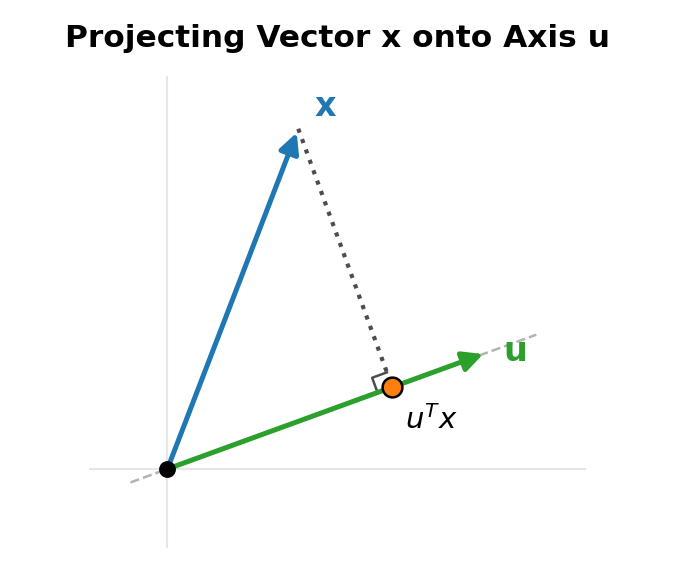
If is a unit vector (length 1) pointing along the candidate axis, and is a data point, the length of 's projection onto is:
This is just a single number, a scalar, telling you how far along the direction that point sits. Do this for every point in the dataset and you get a whole set of scalars: one projected value per point, along that one axis.
The Objective: Maximize the Variance of the Projections
Now the question PCA actually needs answered: which unit vector should we pick? Any direction is a candidate. But projecting onto the wrong direction collapses points that were genuinely different into nearly the same value (this is exactly the PC2 collapse from the previous post), while projecting onto the right direction keeps them spread apart.
"Spread apart" is variance. So the projected values' variance, as a function of , is the quantity to maximize:
This is PCA's entire mathematical objective in one line: find the unit vector that maximizes the variance of the data once every point is projected onto it. Once we have that , it is the first principal component. Solving this maximization is a constrained optimization problem (constrained because has to stay a unit vector), and solving it directly needs machinery we won't derive here. Instead, it helps to know two prerequisite ideas first: covariance, and eigenvectors/eigenvalues. Once those are in place, the solution to the objective above turns out to be almost embarrassingly clean.
Variance Isn't Enough: Covariance
Ch.38 established that variance measures how spread out a single column is. But variance only ever looks at one axis at a time; it can't say anything about how two columns move together. Two completely different-looking datasets can have identical per-column variance while having totally different relationships between the columns.
Covariance fixes this. For two variables and :
This is the correlation formula (its range is ):
The sign is what carries the information:
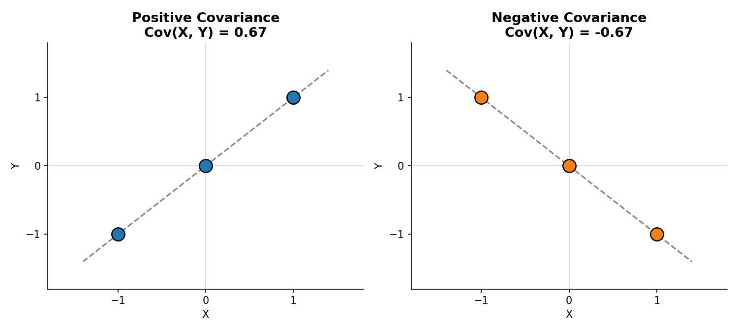
Positive covariance means as increases, tends to increase too. Negative covariance means as increases, tends to decrease. Unlike correlation, covariance isn't bounded to , its magnitude depends on the scale of the data, but the sign alone already tells you the direction of the relationship between two axes.
The Covariance Matrix
With more than two columns, you don't just want pairwise covariances one at a time, you want all of them at once, organized. That's the covariance matrix. For a dataset with columns , , , it's a matrix:
Two structural facts make this matrix special:
- The diagonal is variance. , so the diagonal entries are exactly the per-column spreads we already know how to compute.
- It's symmetric. , so the matrix mirrors across its diagonal. For columns it generalizes to an symmetric matrix the same way.
Put together, the covariance matrix is a complete description of a dataset's shape: the diagonal says how spread out the data is along each original axis, and the off-diagonal entries say how those axes lean on each other. Spread and orientation, both in one matrix.
Matrices as Transformations, and the Vectors That Don't Rotate
The second prerequisite is eigenvectors and eigenvalues, and understanding them starts with a simple idea: a matrix is a transformation.
Picture a coordinate system full of points, every point really a vector from the origin. Multiplying every one of those vectors by a matrix moves them all at once, the whole space can rotate, stretch, squash, or flip. The identity matrix is the one special case that changes nothing at all; every other matrix moves at least some vectors off their original line.
But for almost any transformation, a handful of vectors are special: their direction doesn't change. They might get longer, shorter, or flip to point the opposite way along the same line, but they never rotate off their original span. Those are eigenvectors, and the factor by which they get stretched (or shrunk, or flipped) is the corresponding eigenvalue. The defining relationship is:
is the matrix (the transformation), is the eigenvector, and (lambda) is the eigenvalue, just a scalar. Multiplying the matrix by its own eigenvector is identical to just multiplying that same vector by a number. A 2D linear transformation has (up to) two independent eigenvector directions; a 3D one has (up to) three.
Why This Matters for PCA
Here's the connection: the matrix we care about transforming with is the covariance matrix itself. The covariance matrix already tells us spread and orientation. Its eigenvectors are the directions in the data that don't get rotated away by that spread/orientation structure, they're the data's own natural axes. Solving the maximization problem from earlier (using a technique called the Rayleigh quotient, which is out of scope here) leads to a strikingly simple result:
The eigenvector of the covariance matrix with the largest eigenvalue points in the exact direction of maximum variance. That eigenvector is the first principal component. The eigenvector with the second-largest eigenvalue is the second principal component, and so on, each one orthogonal to the ones before it.
The Full Algorithm
Putting the pieces together, PCA reduces to a short, mechanical sequence of steps:
- Mean-center the data. Subtract each column's mean from itself so the data is centered at the origin. Not strictly mandatory, but consistently improves PCA's numerical behavior.
- Compute the covariance matrix of the (centered) data.
- Find the eigenvalues and eigenvectors of that covariance matrix.
- Rank the eigenvectors by their eigenvalues, largest first. These ranked eigenvectors are the principal components, PC1, PC2, PC3, and so on, up to the original number of columns.
- Project the data onto however many top components you want to keep, by taking the dot product of the data with the transpose of the chosen eigenvectors.
Step 5 is genuinely just matrix multiplication: if is the (n, d) data matrix and is the (d, k) matrix of the top eigenvectors, the reduced dataset is , shape (n, k). No further cleverness needed.
Code Walkthrough: 3D Down to 2D
To make this concrete, here's the whole pipeline run on a real dataset: 40 points with 3 features (feature1, feature2, feature3) split across 2 classes.
df.head() feature1 feature2 feature3 target
0 0.666988 0.025813 -0.777619 1
1 0.948634 0.701672 -1.051082 1
2 -0.367548 -1.137460 -1.322148 1
3 1.772258 -0.347459 0.670140 1
4 0.322272 0.060343 -1.043450 1
Plotted directly, the raw 3D data looks like this, the two classes overlapping but distinguishable along a diagonal direction:
import matplotlib.pyplot as plt

ax = plt.figure().add_subplot(projection='3d')
for target, color in [(1, 'tab:blue'), (2, 'tab:orange')]:
    subset = df[df['target'] == target]
    ax.scatter(subset['feature1'], subset['feature2'], subset['feature3'], color=color, edgecolor='black')
plt.show()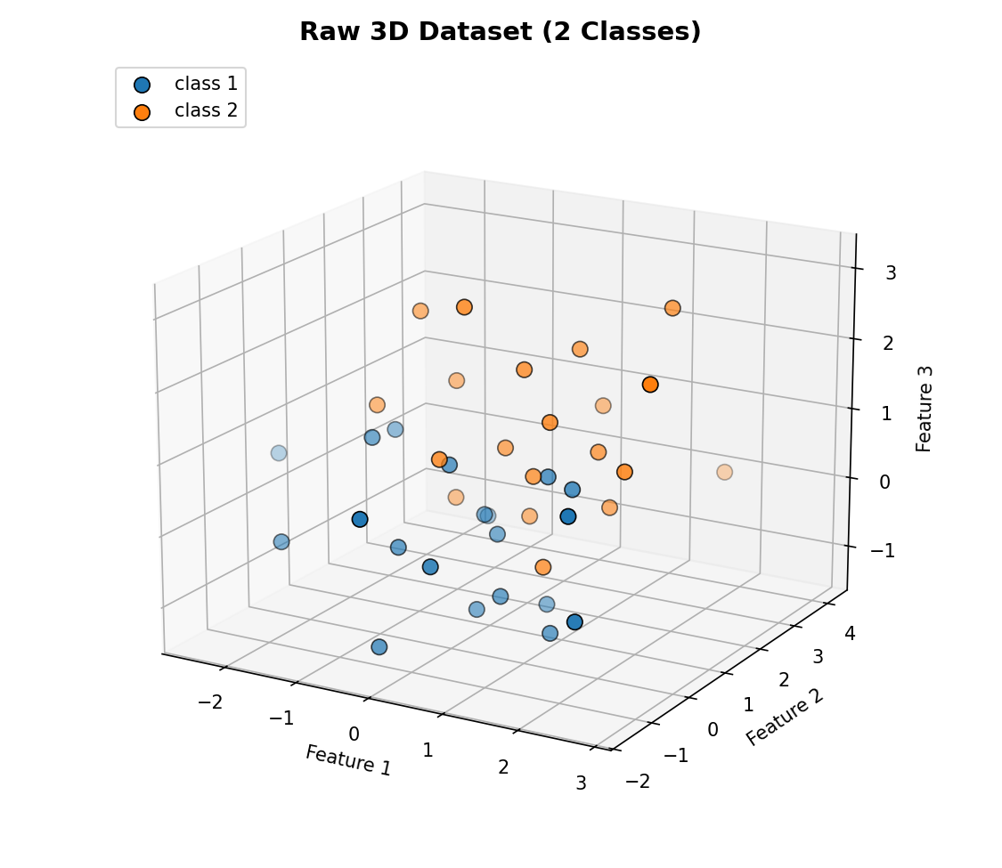
Step 1-3: Standardize, Covariance Matrix, Eigendecomposition
scaler = StandardScaler()
X = scaler.fit_transform(df[['feature1', 'feature2', 'feature3']].values)

cov_matrix = np.cov(X.T)
eigen_values, eigen_vectors = np.linalg.eig(cov_matrix)

order = np.argsort(eigen_values)[::-1]
eigen_values = eigen_values[order]
eigen_vectors = eigen_vectors[:, order]
For this dataset, that produces eigenvalues of roughly [1.35, 0.95, 0.78]. The largest one, 1.35, belongs to PC1. Drawing the top 2 eigenvectors directly on top of the (standardized) data makes the abstraction concrete: these aren't arbitrary lines, they're the data's own computed axes of maximum spread.
ax = plt.figure().add_subplot(projection='3d')
ax.scatter(X[:, 0], X[:, 1], X[:, 2], c=df['target'], edgecolor='black')

t = np.linspace(-3, 3, 2)
pc1_line = np.outer(t, eigen_vectors[:, 0])
pc2_line = np.outer(t, eigen_vectors[:, 1])
ax.plot(*pc1_line.T, color='black', linewidth=3)   # PC1
ax.plot(*pc2_line.T, color='gray', linewidth=3)    # PC2
plt.show()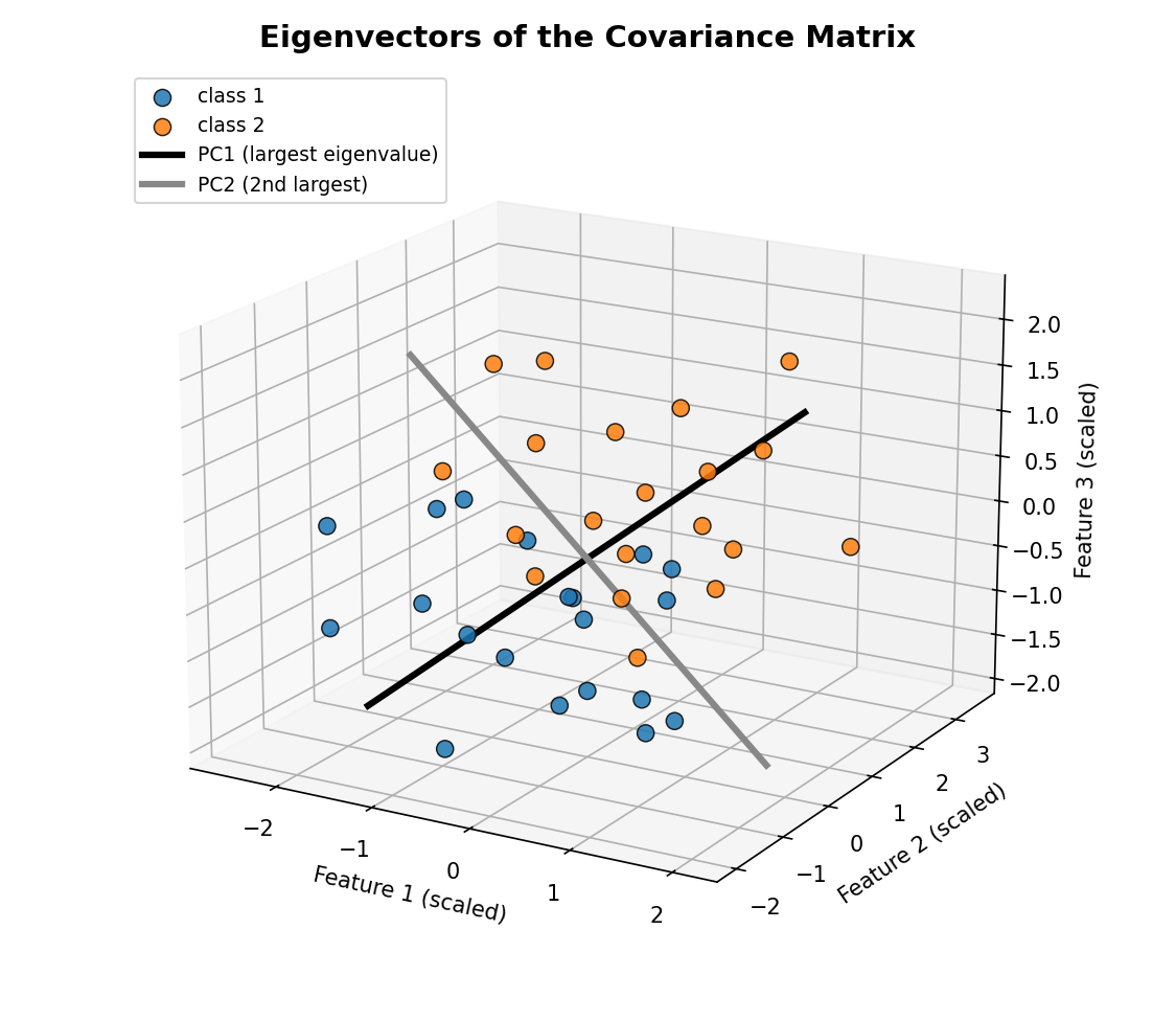
PC1 (black) runs right along the direction the two classes are most stretched apart. PC2 (gray) is the next-best direction, orthogonal to PC1, capturing whatever spread is left over once PC1's direction is accounted for.
Step 4-5: Rank and Project
pc = eigen_vectors[:, 0:2]          # top 2 eigenvectors, shape (3, 2)
transformed = np.dot(X, pc)          # (40, 3) dot (3, 2) -> (40, 2)

new_df = pd.DataFrame(transformed, columns=['PC1', 'PC2'])
new_df['target'] = df['target'].values
That single dot product is the entire dimensionality reduction step. The result is a brand-new 2-column dataset, PC1 and PC2, standing in for the original three features:
plt.scatter(new_df['PC1'], new_df['PC2'], c=new_df['target'], edgecolor='black')
plt.xlabel('PC1')
plt.ylabel('PC2')
plt.title('Data Projected onto the Top 2 Principal Components')
plt.show()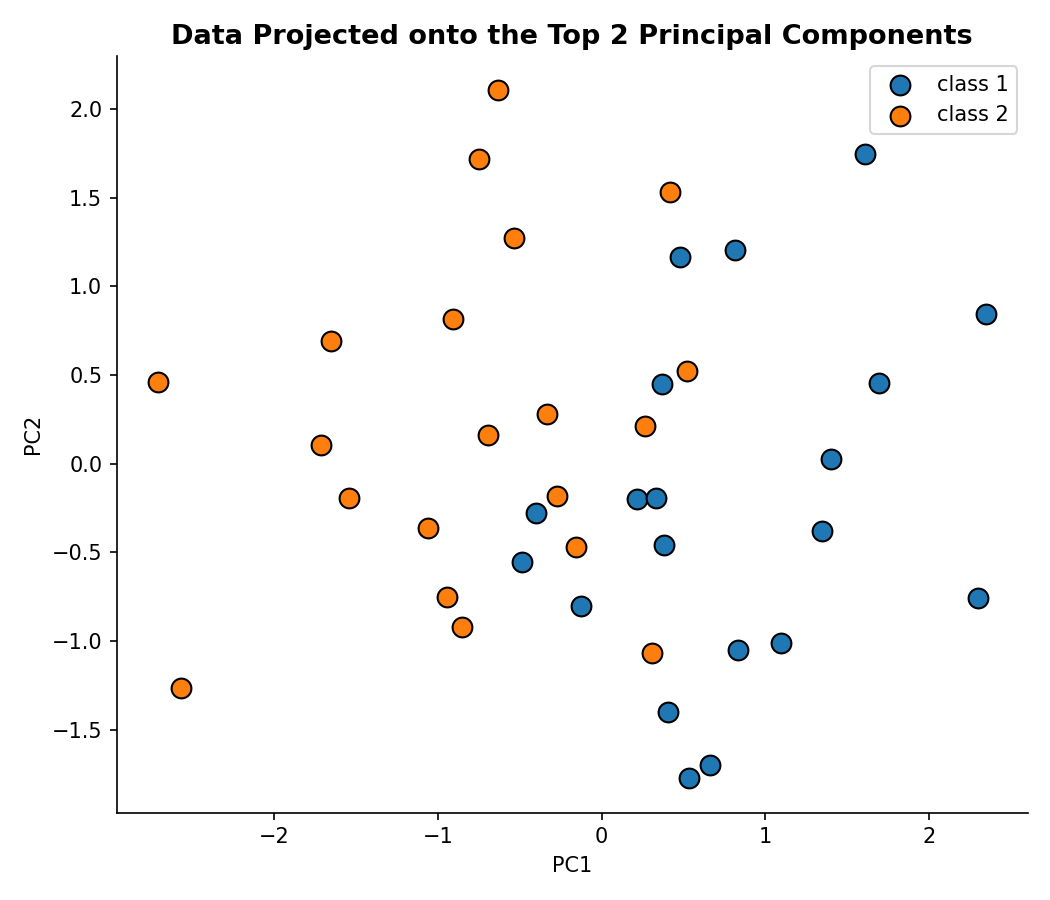
The two classes, which lived in a 3D cube a moment ago, are now visibly separable in a flat 2D plot, using only the two directions that captured the most spread (together, roughly 75% of the total variance in this particular dataset). This is exactly the payoff promised back in the intuition post: fewer dimensions, same essential structure.
What's Next?
We now have PCA fully specified: the variance-maximization objective, the covariance matrix that encodes a dataset's spread and orientation, and the eigenvector/eigenvalue math that solves the objective in closed form. The next post moves to a real-world dataset and works through applying PCA end to end in more depth, including how to decide how many components to keep.