
Ch.38: Principal Component Analysis, Part 1 - Geometric Intuition and Variance
Inspired by: YouTube
In the previous post, we introduced the two paths out of the Curse of Dimensionality: Feature Selection (pick a subset of existing columns) and Feature Extraction (build new, fewer columns that combine the originals). We named Principal Component Analysis (PCA) as the most important Feature Extraction technique but stopped short of explaining how it actually works.
This post builds that intuition from scratch, without the eigenvector math yet. We will see exactly where Feature Selection breaks down, why PCA's fix is to rotate the coordinate axes instead of discarding columns, and why the single quantity it optimizes for is variance. Every claim below is backed by a real generated plot, not a hand-drawn diagram.
What PCA Is, and Isn't
A few grounding facts before diving in:
- PCA is unsupervised. It only looks at the input columns; there is no target/label involved.
- It is old and well established. The core idea traces back to Karl Pearson in 1901, and it has been a standard tool in statistics and machine learning ever since.
- It is a Feature Extraction technique. Its goal is to reduce the number of dimensions in a dataset while preserving as much of the original information as possible.
- Its benefits are twofold: faster training (fewer columns means less computation) and visualization (a dataset with hundreds of columns can be compressed down to 2 or 3 dimensions and actually plotted).
The classic way to build intuition for PCA is a photography analogy. A sports photographer is trying to capture a 3D soccer match on a flat, 2D photo. They don't just plant the camera anywhere. They walk the sideline, looking for the angle where the players are most spread out and least overlapping, because that's the angle that preserves the most information about the scene. PCA does the same thing mathematically: it takes high-dimensional data and finds the projection (the "best angle") that keeps the most spread, and therefore the most signal, when compressing down to fewer dimensions.
Feature Selection, Revisited
Before Feature Extraction makes sense, it helps to see exactly where Feature Selection, the simpler of the two approaches, runs into trouble.
Consider a small housing dataset with two candidate input columns, and a target (price) we're not even using yet:
- Number of Rooms
- Nearby Grocery Shops
If a real-estate agent looked at this, they'd immediately say rooms matters far more to price than nearby grocery shops. Housing price obviously depends heavily on room count; grocery shop count barely moves the needle. Feature Selection formalizes that intuition without needing domain knowledge: project every point onto each axis and measure how much it spreads out there. The star markers below sit at the two most extreme points in the data (bottom-left and top-right); the dashed guides and bracket arrows show where those two points, and by extension the whole cloud, land once collapsed onto a single axis (counts are jittered slightly on the plot for legibility, the variance is computed on the real integer values):
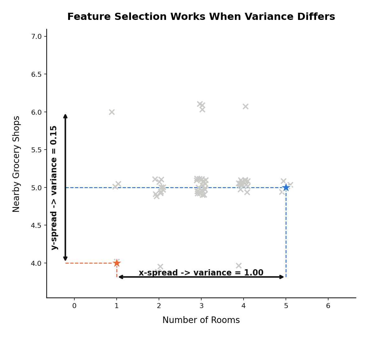
Rooms spans a wide range and grocery shops barely moves. Projecting every point down onto each axis and measuring that 1D spread directly, rooms comes out to a variance of 1.00 against 0.15 for grocery shops, close to a 7x difference. Given a choice between the two, you keep rooms and drop grocery shops: it's the column doing almost all of the work.
Where This Breaks Down
Now swap grocery shops for a column that's clearly not interchangeable with rooms in the real world, but is strongly related to it: Number of Washrooms. A bigger flat tends to have both more rooms and more washrooms, so the two columns move together.
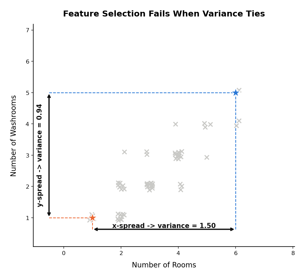
The scatter now trends diagonally instead of forming a shapeless blob, and critically, the two projected variances are close (1.50 vs. 0.94) instead of one dwarfing the other. There's no longer a clear "drop this one" answer just by comparing spread column by column. Yet intuitively, price depends on both: a bigger flat needs to be described by both its rooms and its washrooms together, not by either one alone with the other discarded.
This is the exact failure mode Feature Selection cannot resolve: when candidate columns are correlated and carry comparable individual variance, there's no principled way to pick a "more important" one by looking at each column in isolation. Feature Selection can only keep or discard whole columns as they already exist. It has no way to combine two correlated columns into something that captures both at once.
Feature Extraction: Build a New Column Instead
Feature Extraction sidesteps the problem entirely by not choosing between the existing columns at all. Instead of asking "rooms or washrooms?", imagine handing this problem to an actual real-estate broker with domain expertise. Their answer would likely be: don't pick one, replace both with flat size. More rooms and more washrooms both push flat size up, so a single new column, size, carries the information that used to live in two correlated columns.
That's the core move of Feature Extraction, and specifically of PCA: discard the original coordinate axes and construct entirely new ones that are combinations of the originals, chosen so that as little information as possible is lost in the process. The number of new axes (principal components) can never exceed the original number of columns, but you get to choose how many of them to actually keep, ranked by how much of the original data's information each one captures.
The Geometric Picture: Rotating the Axes
Concretely, what PCA does to the rooms/washrooms data is rotate the coordinate system. Instead of measuring every point along the original "Rooms" and "Washrooms" axes, it finds a new pair of perpendicular axes, one that points along the direction the data is most stretched out in, and one perpendicular to it, and re-measures every point against those instead.
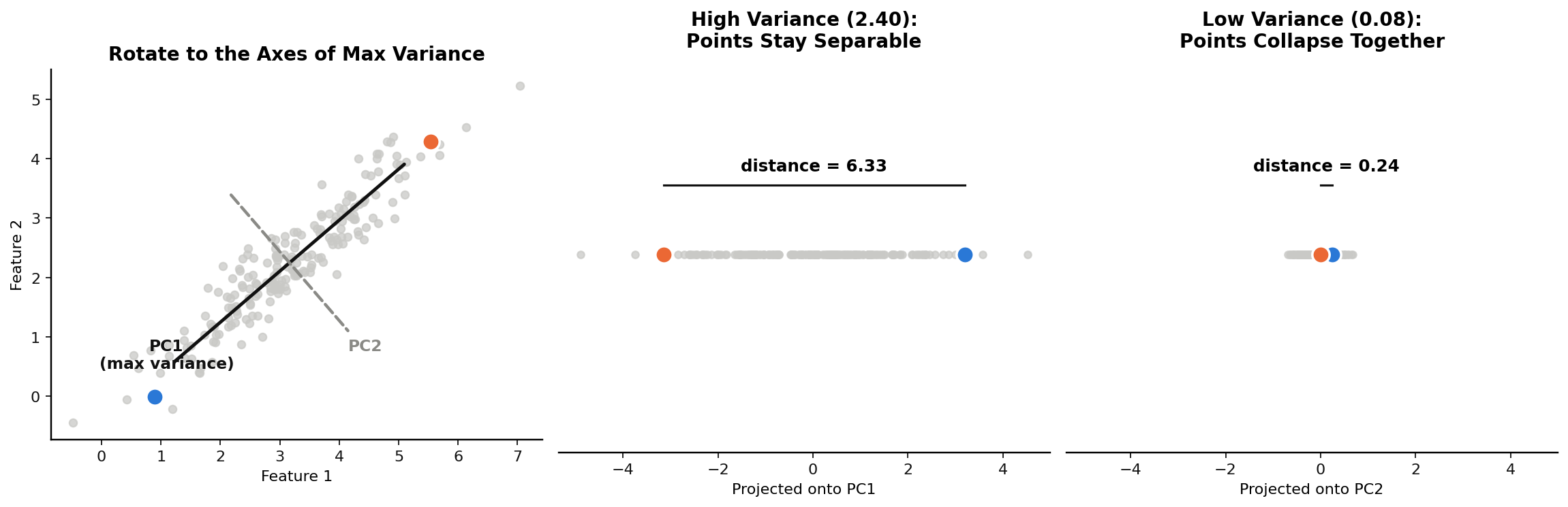
The left panel shows the rotation directly: PC1 (solid black) is the new axis running along the direction the correlated cloud is most stretched, and PC2 (dashed gray) is perpendicular to it. This chart is computed on real data, not drawn by hand: the axes shown are the actual best-fit rotation for this point cloud, not an illustrative sketch. Exactly how that rotation gets computed is the mechanism we're deliberately deferring to the next post. The number of principal components always equals the number of original columns, so a 2-column dataset yields exactly 2 components, PC1 and PC2, ranked by how much of the data's spread each one captures.
The middle and right panels show why the ranking matters. Two specific points (blue and orange) are tracked through both projections. Projected onto PC1, the axis of maximum spread, they land 6.33 units apart, clearly distinguishable. Projected onto PC2, the low-variance axis, the same two points land only 0.24 units apart, they've nearly collapsed into the same point. If you were forced to keep only one axis, PC1 is the obvious choice: it's the one that preserves whether these two points actually looked different to begin with.
This directly mirrors the photographer analogy from earlier. Shoot a football match from the angle where players overlap and you lose them in the frame; shoot from the angle where they're spread out and every player stays visible. PC1 is the "spread out" angle for this dataset.
Variance: The Concept PCA Is Actually Maximizing
Everything above hinges on one repeated word: spread. It's time to make that precise. In statistics, the formal measure of spread is variance.
Mean Tells You Where, Variance Tells You How Wide
Mean answers "where is the center of this data?" It says nothing about how the data is distributed around that center. Two very differently-shaped datasets can share the same mean:
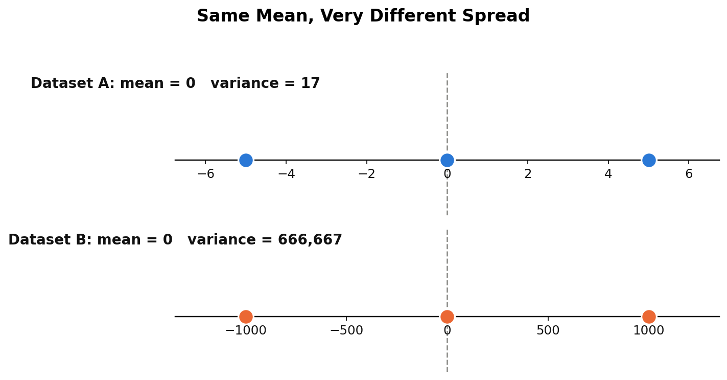
Both datasets have a mean of exactly 0, but they are nowhere close to the same shape. Dataset A is tightly clustered near the center; Dataset B is spread across a vastly wider range. Variance is the number that captures this difference: 17 for A against 666,667 for B. Variance is what tells these two datasets apart when the mean can't.
The formula for variance is:
For each point, take its distance from the mean, square it, and average those squared distances across every point. Squaring serves two purposes: it makes every deviation positive (so points below the mean don't cancel out points above it), and unlike using the absolute value , it's differentiable everywhere, which matters because PCA is ultimately solved as an optimization problem, and optimization needs a smooth, differentiable objective. This is also why the closely related standard deviation, , exists: variance is in squared units (rooms², washrooms²), which is awkward to interpret, so taking the square root brings it back to the data's original units while preserving the same ranking of "which dataset is more spread out."
Why Variance Is the Exact Right Thing to Maximize
The three-panel chart earlier already showed this in action, but it's worth stating as the general principle underlying all of PCA: when high-dimensional data gets compressed into fewer dimensions, the only way to keep two points looking as different as they actually are is to project along the direction where the data varies the most. Project along a low-variance direction and points that were genuinely different in the original space get squeezed toward the same value, and the model downstream (KNN, clustering, anything distance-based) loses the ability to tell them apart. This is precisely the same distance-collapse problem from the Curse of Dimensionality post, now viewed from the other direction: instead of more dimensions destroying distance, we're asking which fewer dimensions best preserve it, and the answer is: the ones with the most variance.
This is why PCA's entire objective, once formalized mathematically, reduces to a single sentence: find the new axis (or axes) along which the projected data has maximum variance. Everything from here is just the mechanics of actually solving that one optimization problem, which is where the linear algebra comes in.
What's Next?
We now have the full geometric and statistical intuition for PCA: rotate the coordinate axes, and choose the rotation that maximizes variance along the new axes. What's still missing is the actual mechanism for finding that rotation. In the next post, we'll cover the linear algebra PCA uses to get there: covariance matrices, eigenvalues, and eigenvectors. A third post after that will apply PCA in code end to end.