
Ch.38: Entropy, Information Gain, and Gini Impurity
Inspired by: YouTube
Last post left two questions open: which feature should a node split on, and when should splitting stop. This post answers the first one, and along the way builds the tool (entropy, and its faster cousin Gini impurity) that later posts will reuse to answer the second.
1. The Play Tennis Dataset
The worked example is the classic dataset used to teach this: 14 days, four weather features, and whether tennis was played.
| outlook | temperature (°F) | humidity | wind | play |
|---|---|---|---|---|
| sunny | 85 | high | weak | no |
| sunny | 80 | high | strong | no |
| overcast | 83 | high | weak | yes |
| rain | 70 | high | weak | yes |
| rain | 68 | normal | weak | yes |
| rain | 65 | normal | strong | no |
| overcast | 64 | normal | strong | yes |
| sunny | 72 | high | weak | no |
| sunny | 69 | normal | weak | yes |
| rain | 75 | normal | weak | yes |
| sunny | 75 | normal | strong | yes |
| overcast | 72 | high | strong | yes |
| overcast | 81 | normal | weak | yes |
| rain | 71 | high | strong | no |
9 days say yes, 5 say no. outlook, humidity, and wind are categorical; temperature is numeric and gets its own section later. The question this post answers: of outlook, humidity, and wind, which one should the root node split on first?
2. What Is Entropy
Entropy measures how mixed up, or "disordered," a set of labels is. A set that's all one class is perfectly ordered, entropy 0. A set split evenly between two classes is maximally disordered, since knowing nothing else, a guess is a genuine coin flip. Entropy is highest exactly there.
For a set with classes , each making up a fraction of :
For the binary case (two classes, and ), this simplifies to , which looks like this across every possible :
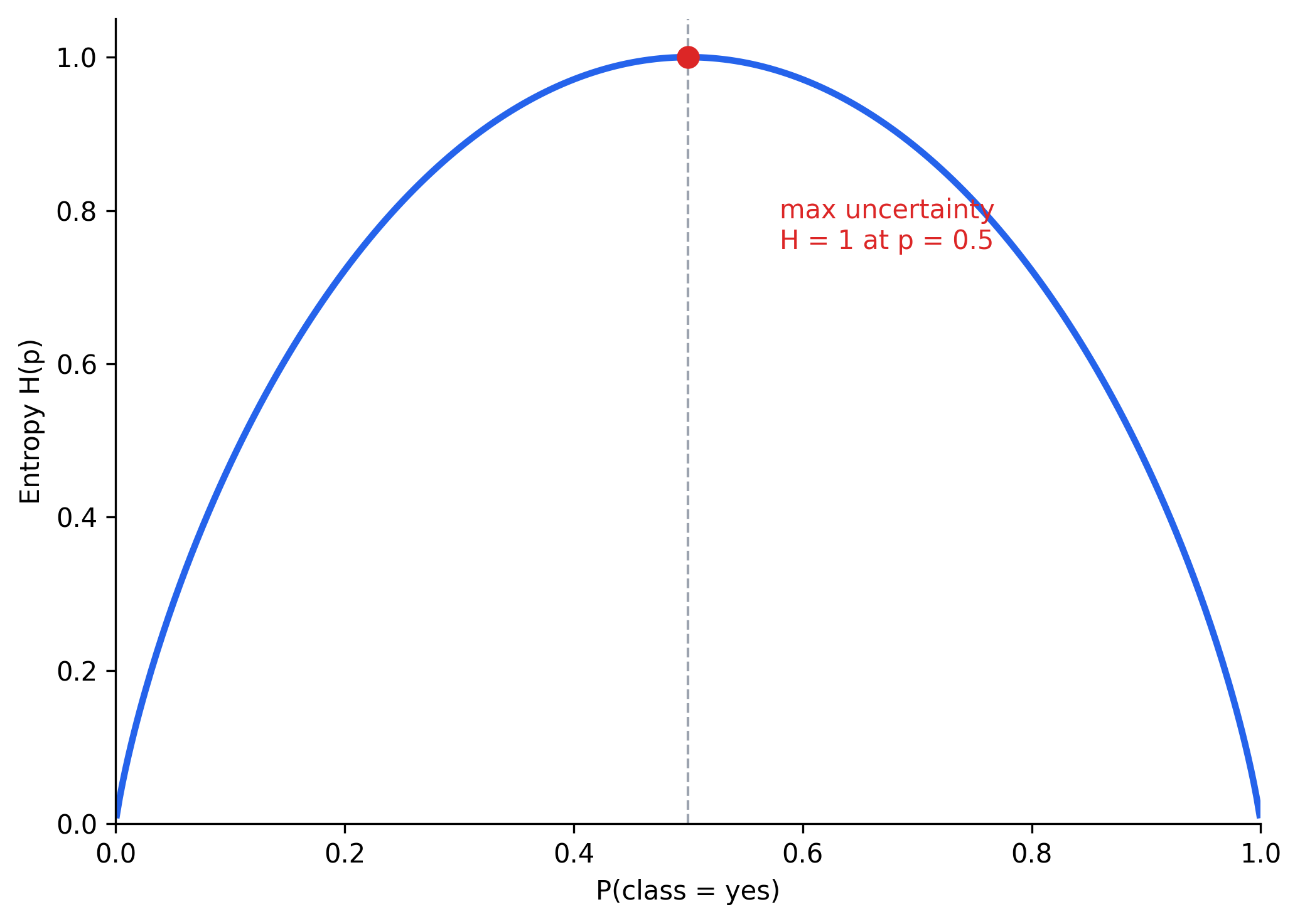
Two things worth noting directly off this curve: entropy is 0 at both ends (p = 0 or p = 1, a pure set) and peaks at exactly 1 when p = 0.5 (a perfect 50/50 mix). It's also perfectly symmetric, H(0.3) = H(0.7), entropy only cares how mixed the set is, not which class happens to be in the majority.
3. Computing Entropy on Play Tennis
The root node holds all 14 rows: 9 yes, 5 no, so , .
Close to the maximum of 1, as expected: 9-vs-5 is fairly close to an even split.
4. Information Gain
Entropy alone describes a single set. To decide which feature to split on, compare the parent's entropy against the weighted-average entropy of the children that split would produce, that difference is information gain:
A feature that produces children with low entropy (each child mostly one class) scores a high information gain; a feature that barely changes how mixed the children are scores close to zero. Working this out for outlook, which splits the 14 rows into three groups:
| outlook value | rows | yes / no | entropy |
|---|---|---|---|
| sunny | 5 | 2 / 3 | 0.971 |
| overcast | 4 | 4 / 0 | 0.000 |
| rain | 5 | 3 / 2 | 0.971 |
Running the same computation for the other two categorical features:
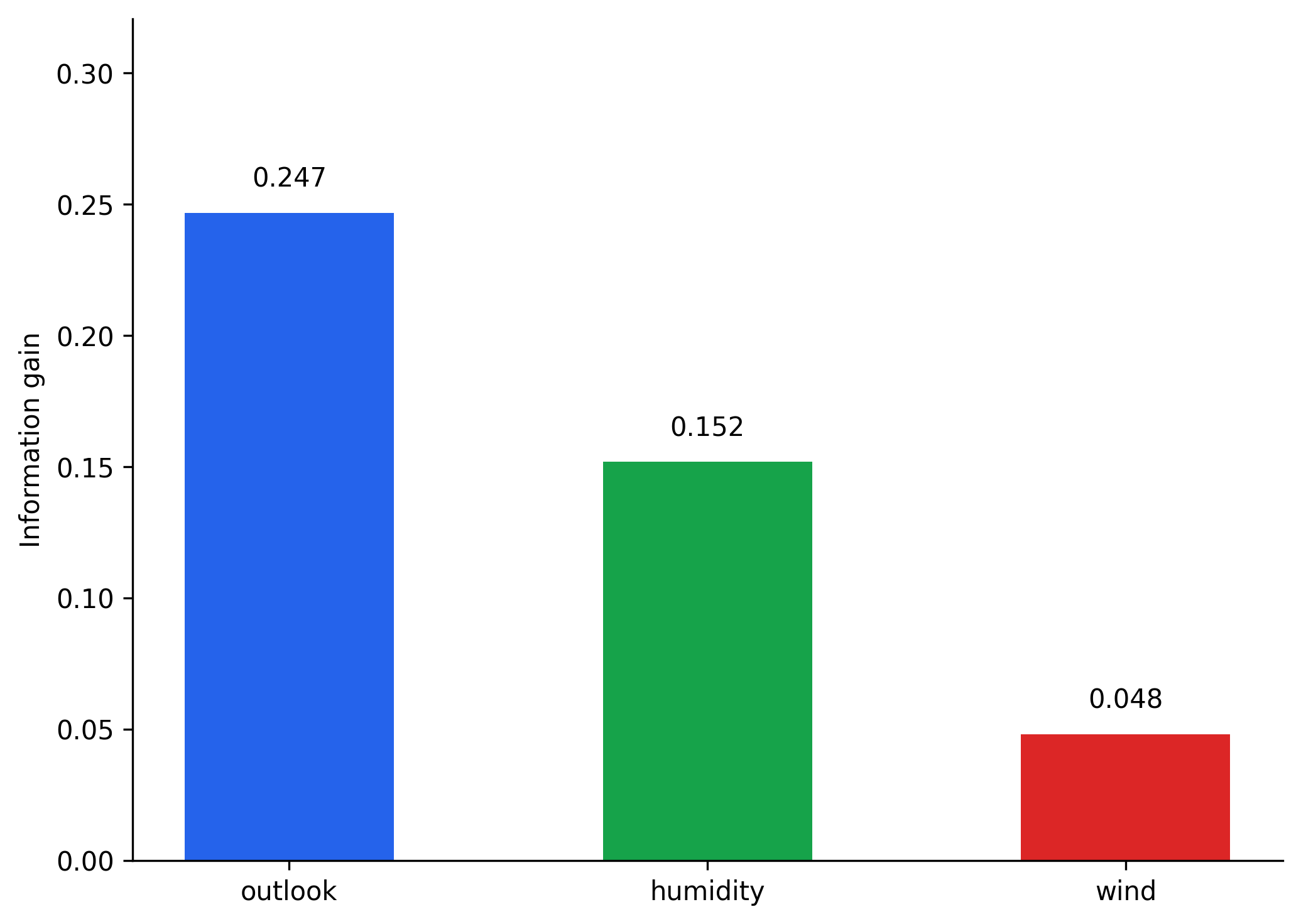
outlook wins by a clear margin, which lines up with what the raw numbers already hinted at: overcast alone perfectly separates 4 pure yes rows, dragging the weighted entropy down more than any other feature manages. The root node splits on outlook. The overcast branch is already done (entropy 0, a pure leaf); sunny and rain each still have mixed labels and need a further split, chosen by running this exact same information-gain computation again, but only on the rows within that branch.
5. Observations
A few things fall out of working through this by hand, worth stating explicitly since they generalize to every tree the rest of this series builds:
- A feature that produces even one pure child (entropy
0, likeovercastabove) gets a real boost in information gain, even if its other children are messy. - Information gain can never be negative, splitting a set can only decrease or maintain its weighted entropy, never increase it. The question is only ever how much it decreases, not whether.
- A feature with many possible values has a structural advantage: more branches means more opportunities to isolate small pure groups. Taken to the extreme, splitting on a column that's unique per row (like an ID) would produce information gain close to the maximum, every child would have exactly one row, entropy
0, despite being a completely useless feature to split on in practice. (The standard fix, a gain ratio that normalizes by how many branches a split creates, is a refinement left for when this becomes a practical problem.)
6. Entropy vs Probability, Revisited
It's worth re-reading the entropy curve from Section 2 with a decision-tree lens rather than a pure-math one: a node is "good" (low entropy) exactly when it's lopsided toward one class, and "bad" (high entropy) exactly when it's a coin flip. Every split a tree makes is, in effect, trying to drag each child node's away from 0.5 and toward one of the two edges of that curve.
7. Gini Impurity
Entropy involves a logarithm for every class, computed at every candidate split, for every node, this adds up. Gini impurity measures almost the same thing, "how mixed is this set," with cheaper arithmetic:
Overlaying both curves for the binary case shows how similar they actually are:
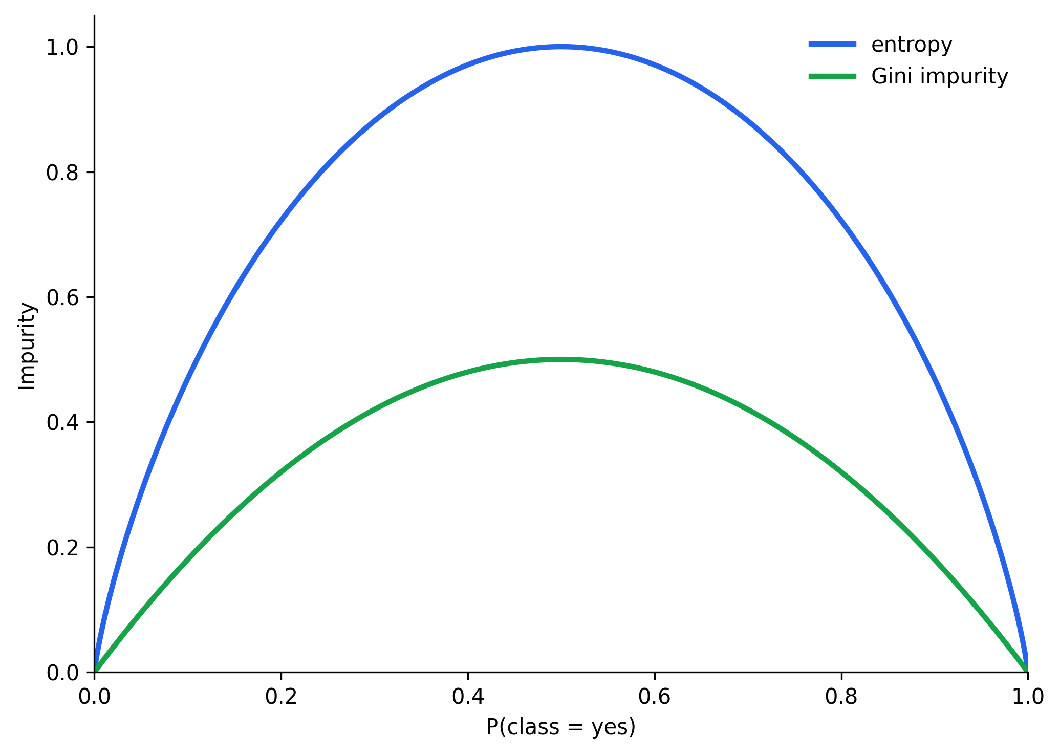
Same shape, same zeros at the pure ends, same peak location at p = 0.5, just a lower ceiling (0.5 instead of 1) and no logarithm to compute. This is why CART, the specific algorithm named at the end of the last post, defaults to Gini impurity rather than entropy: in practice the two pick nearly identical splits almost all the time, but Gini is faster to compute at scale. Running the root-node numbers through Gini instead of entropy confirms the same feature wins:
For outlook: Gini(sunny) = 0.480, Gini(overcast) = 0.000, Gini(rain) = 0.480, weighted average ≈ 0.343, a Gini-based "gain" of 0.459 − 0.343 ≈ 0.116, still the largest of the three features. The specific numbers differ from entropy's, but the winner doesn't.
8. Handling Numerical Data
Section 4 (of the previous post) left one question open: for a numeric feature, which threshold do you actually split on? The answer is a search, not a formula: sort the feature's unique values, take the midpoint between each consecutive pair as a candidate threshold, and compute information gain for that candidate exactly like a categorical split, < threshold versus ≥ threshold playing the role of the two branches.
Running that sweep over temperature in the Play Tennis data (14 rows, unique values 64 through 85, giving 13 candidate midpoints):
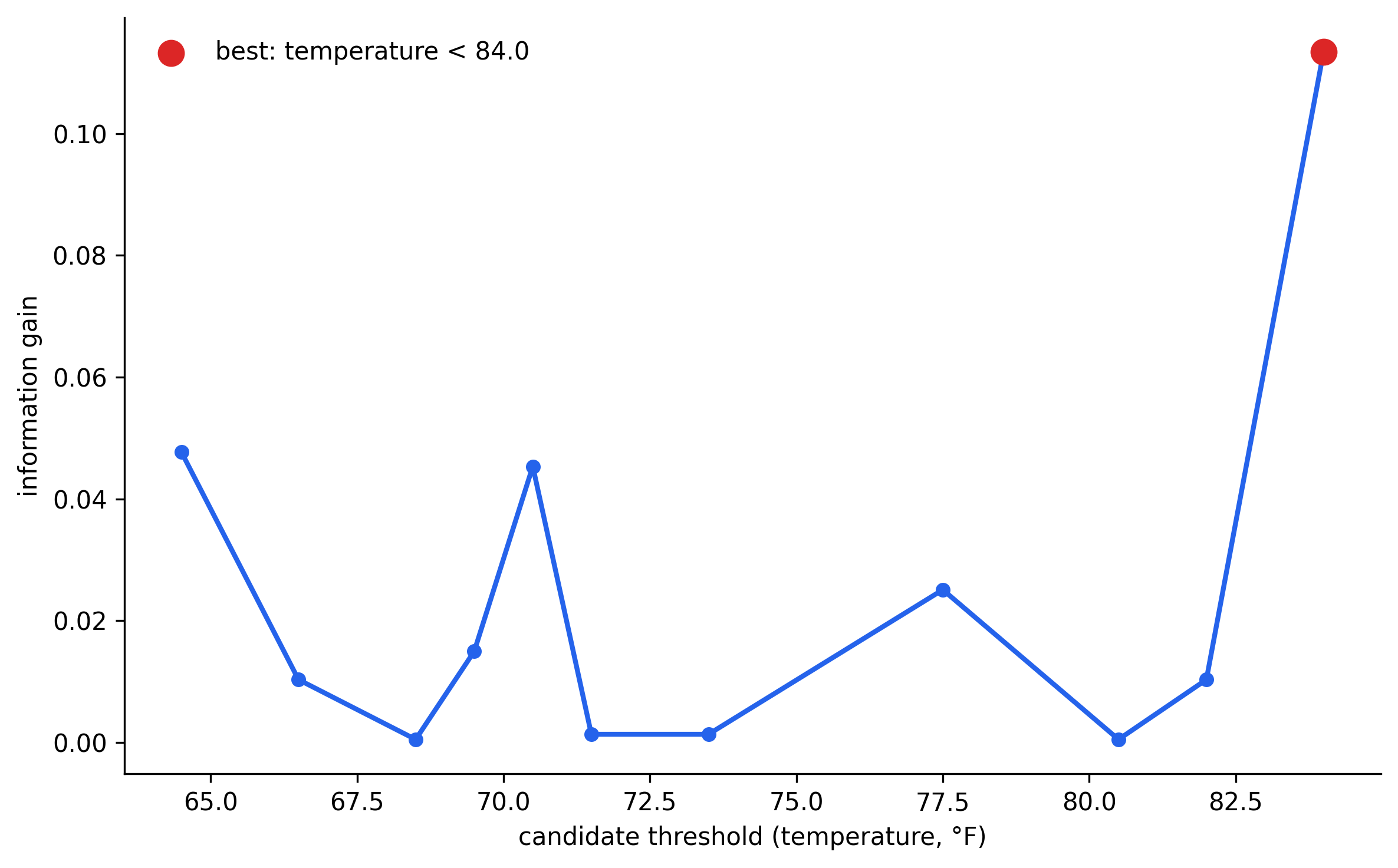
The best candidate, temperature < 84, is picked exactly the way outlook was picked among categorical features, by comparing information gain across every candidate and keeping the largest. The only real difference from the categorical case is volume: a categorical feature has one gain to compute, a numeric feature has one gain per candidate threshold, which is also why Gini's cheaper arithmetic tends to matter more in practice than the entropy-vs-probability curve alone would suggest, this search runs at every single node, for every numeric feature, throughout training.
With this, the two open questions from the intuition post are down to one: choosing which feature and threshold to split on is fully specified by entropy/Gini and information gain. Deciding when to stop splitting, and what to do about a tree that overfits by splitting all the way down, is still ahead.