
Ch.35: Percentile Method for Outlier Detection and Removal
Inspired by: YouTube
In the previous post, we used the IQR Proximity Rule to handle outliers in skewed columns. That method is a step up from Z-score (which only works on normally distributed data), but it still derives its boundaries from the quartile structure of the distribution.
This post covers the general-purpose fallback: the Percentile Method, sometimes called Winsorization. It makes no assumption about distribution shape at all. Whether the column is normal, skewed, bimodal, or something else entirely, the technique works the same way: simply decide how much of each tail to treat as extreme, and clip everything outside that boundary.
What Is a Percentile?
A percentile answers the question: "What value sits at the rank where of all observations in the dataset fall below it?"
The exam-rank intuition makes this concrete. If you scored at the 98th percentile on an exam, it means 98% of students scored below you and only 2% scored above. If you are at the 50th percentile, half the class is below you and half is above: that is the median. If you scored the maximum value in the entire group, you are at the 100th percentile because everyone else scored below you. Conversely, the minimum value sits at the 0th percentile because no one scored below it.
Apply the same logic to any feature column:
| Percentile | Meaning |
|---|---|
| 0th (minimum) | No observations fall below this value |
| 1st | 1% of observations fall below this value |
| 50th (median) | Half fall below, half above |
| 99th | 99% of observations fall below this value |
| 100th (maximum) | All observations fall below or equal this value |
The Core Idea: Rank-Based Boundaries
The percentile method defines outliers purely by rank, not by any statistic that depends on the shape of the distribution:
upper_limit = quantile(0.99)   # 99th percentile
lower_limit = quantile(0.01)   # 1st percentile
Any value above the upper limit or below the lower limit is classified as an outlier.
The threshold is your choice. Common conventions:
- 1% / 99%: The most widely used default. Treats the bottom and top 1% of each column as outliers.
- 0.5% / 99.5%: Tighter. Keeps more data, removes only the most extreme observations.
- 5% / 95%: More aggressive. Useful for noisy sensor data or very heavy-tailed distributions.
This tunability is one of the method's strengths: the percentile cutoff is a hyperparameter. Try 1%, 0.5%, and 2% on your actual downstream model and use whatever produces the best validation result. There is no universally correct value.
Why This Method Works on Any Distribution
Recall the constraint on the other two techniques:
- Z-score (ch33): Requires the column to be approximately normally distributed. The moment the distribution is skewed, the mean and standard deviation are pulled by the tails, making the boundaries unreliable.
- IQR Proximity Rule (ch34): More robust than Z-score and works on skewed data, but the boundaries are still anchored to Q1 and Q3, the 25th and 75th percentiles. The 1.5x multiplier is a convention from box plot design, not a general-purpose guarantee.
- Percentile Method (this post): Makes no distributional assumption. It works by sorting observations and reading off rank positions. Extreme values only affect the specific percentile slots they occupy and nothing else.
Dataset: Weight and Height
We use a 10,000-row dataset with three columns: Gender, Height (in inches), and Weight (in pounds). The source notebook focuses on the Height column. After a quick inspection, Weight does not show notable outliers in this dataset, so we will work with Height only.
import numpy as np
import pandas as pd
import seaborn as sns

df = pd.read_csv('weight-height.csv')
df.head()
Gender Height Weight
0 Male 73.847017 241.893563
1 Male 68.781904 162.310473
2 Male 74.110105 212.740856
3 Male 71.730978 220.042470
4 Male 69.881796 206.349801df.shape
# (10000, 3)Baseline Statistics
df['Height'].describe()count 10000.000000
mean 66.367560
std 3.847528
min 54.263133
25% 63.505620
50% 66.318070
75% 69.174262
max 78.998742The minimum is about 54.3 inches and the maximum is about 79.0 inches. The mean and median are nearly identical (66.37 vs 66.32), confirming the column is very close to normally distributed. Yet even a near-normal column can carry a handful of genuinely extreme values at the tails, and the percentile method catches those regardless of shape.
Visualizing the Raw Distribution
sns.distplot(df['Height'])
sns.boxplot(df['Height'])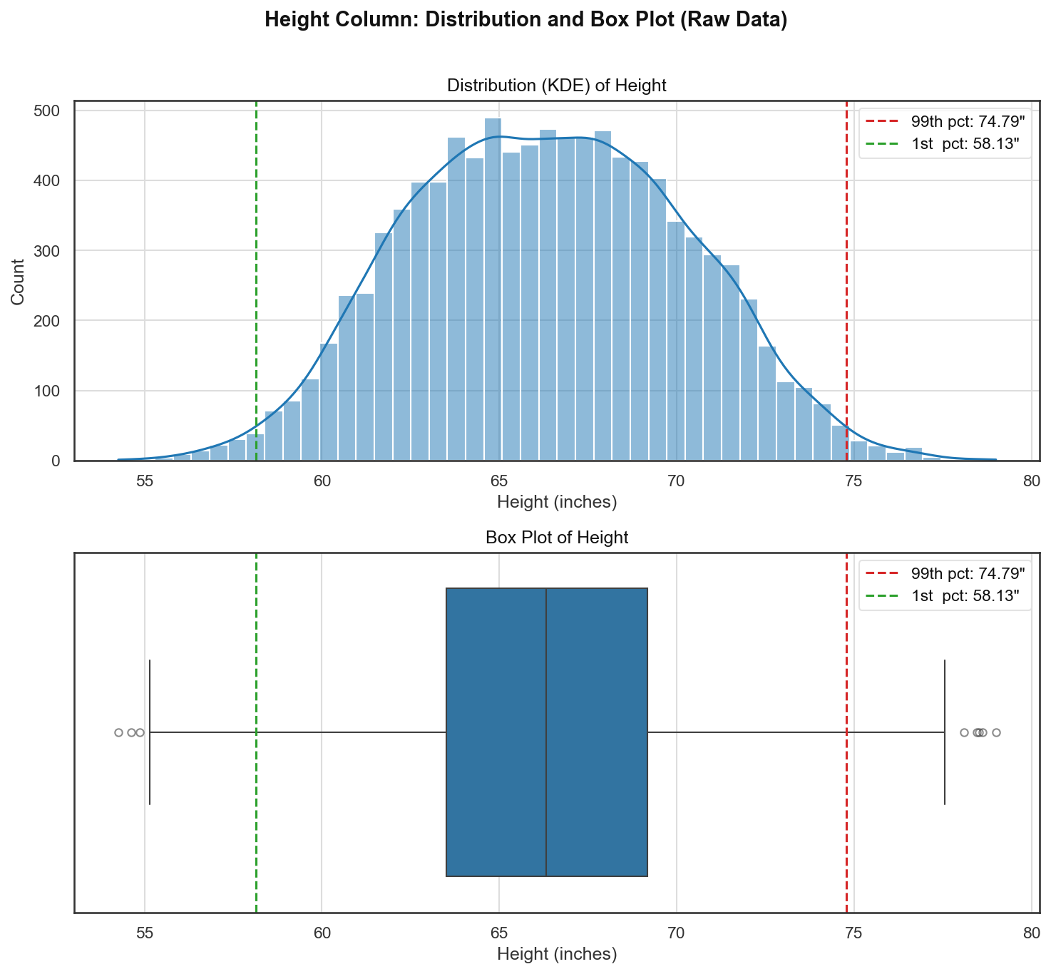
The distribution is nearly symmetric and bell-shaped, confirming what the describe() stats suggested. However, the box plot reveals outlier dots at both ends: a handful of very short individuals and a handful of very tall individuals that fall beyond the box plot whiskers. The dashed red and green lines mark the 1st and 99th percentile boundaries that we will use as our cutoff.
Step 1: Compute the Percentile Limits
upper_limit = df['Height'].quantile(0.99)
lower_limit = df['Height'].quantile(0.01)
print(upper_limit) # 74.786
print(lower_limit) # 58.134Real computed values from this dataset:
| Statistic | Value |
|---|---|
| Upper limit (99th percentile) | 74.79 inches |
| Lower limit (1st percentile) | 58.13 inches |
Every observation above 74.79 inches or below 58.13 inches will be treated as an outlier.
Treatment Approach 1: Trimming
Trimming drops the outlier rows entirely. Both conditions are applied simultaneously with & because this dataset has outliers on both tails:
# Trimming
new_df = df[(df['Height'] <= 74.78) & (df['Height'] >= 58.13)]
new_df['Height'].describe()Note: the notebook uses the literal values 74.78 and 58.13 (rounded from the computed quantiles). Using the computed variables directly is equivalent and cleaner:
new_df = df[(df['Height'] <= upper_limit) & (df['Height'] >= lower_limit)]count 9800.000000
mean 66.364366
std 3.645075
min 58.134496
25% 63.577162
50% 66.318070
75% 69.119896
max 74.785714Key result: the dataset shrinks from 10,000 rows to 9,800 rows, removing exactly 200 rows (roughly 1% from each tail: 100 from the bottom, 100 from the top). The mean barely moves (66.37 to 66.36), but the standard deviation drops from 3.85 to 3.65, and the min/max now sit at the percentile boundaries instead of the true extremes.
Before vs. After Trimming
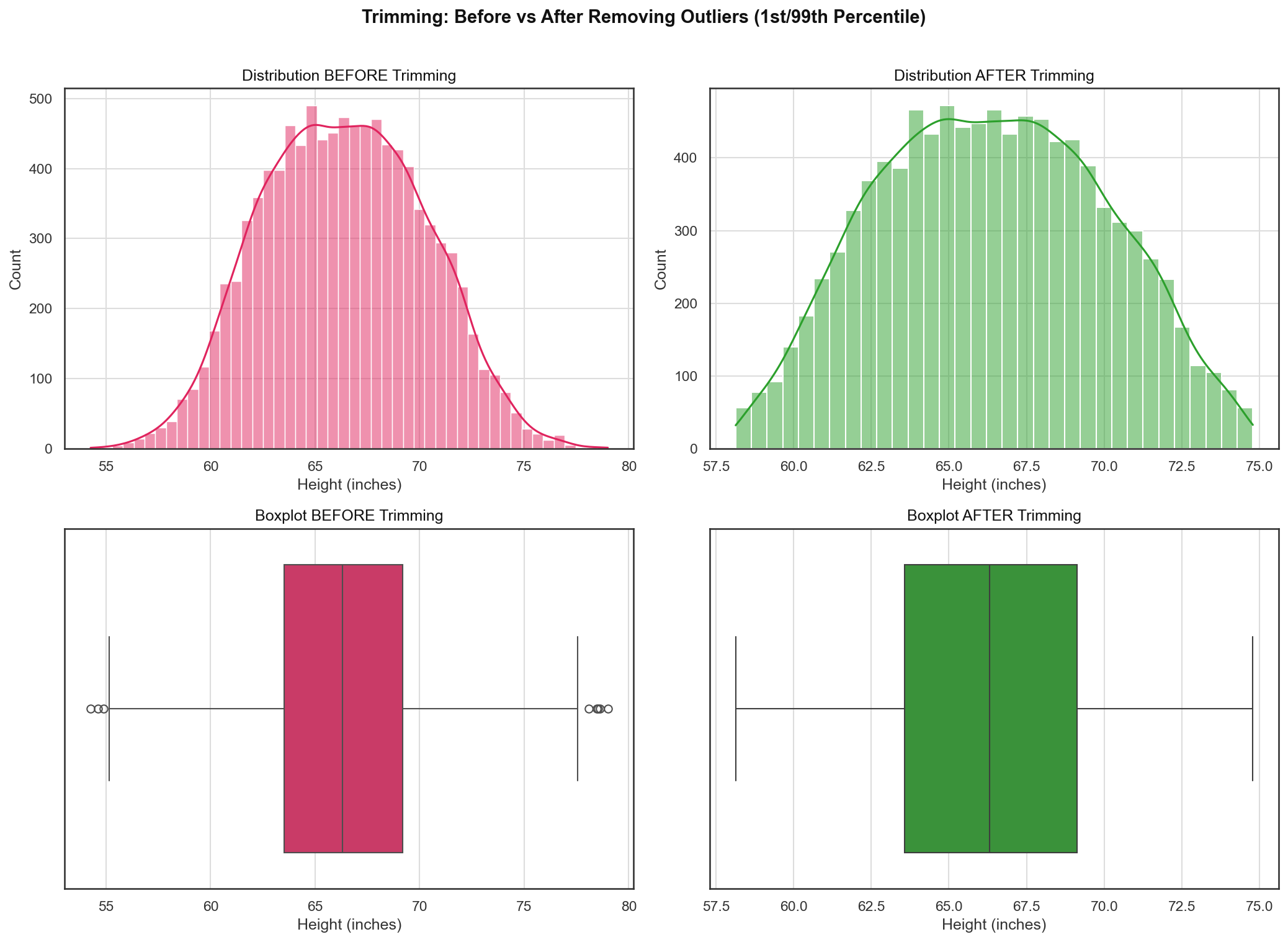
Key observations:
- Distribution plot: The overall bell shape is preserved. The very short and very tall tails are clipped. The curve tightens slightly around the centre.
- Box plot: All outlier dots on both ends disappear. The whiskers now terminate at the smallest and largest remaining values, both of which sit within the percentile boundaries.
Treatment Approach 2: Capping (Winsorization)
When you cannot afford to drop rows, Capping replaces outlier values with the boundary value instead of deleting the row. This is also called Winsorization, a term named after the statistician Charles Winsor who formalized the technique. (The same name appeared in ch34 in the context of IQR-based capping: the Winsorization label applies whenever you clamp extreme values to a boundary, regardless of how that boundary was computed.)
# Capping --> Winsorization
df['Height'] = np.where(df['Height'] >= upper_limit,
upper_limit,
np.where(df['Height'] <= lower_limit,
lower_limit,
df['Height']))The nested np.where logic:
- If
Height >= upper_limit(74.79), replace withupper_limit. - Otherwise, if
Height <= lower_limit(58.13), replace withlower_limit. - Otherwise, keep the original value.
A style variant you will sometimes see in practice uses upper_limit + 1 or lower_limit - 1 as the replacement value instead of the exact boundary. This is a personal preference and makes no material difference to model training: the goal is simply to move the extreme values to some bounded region.
df.shape
# (10000, 3)
df['Height'].describe()count 10000.000000
mean 66.366281
std 3.795717
min 58.134412
25% 63.505620
50% 66.318070
75% 69.174262
max 74.785790All 10,000 rows are preserved. The maximum is now capped at 74.79 inches and the minimum at 58.13 inches, matching the percentile boundaries. The standard deviation tightens slightly (3.85 to 3.80) but the shape is otherwise intact.
Before vs. After Capping
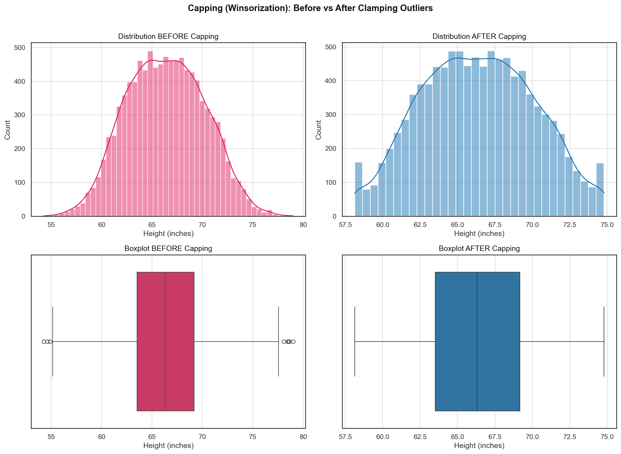
Key observations:
- Distribution plot: Small spikes appear at exactly 58.13 and 74.79 in the "after" panel. This is the signature of capping: every observation that previously exceeded the boundary is now collapsed onto the boundary value. The spike height reflects how many rows were capped at each end.
- Box plot: The outlier dots on both ends disappear. Values that were once scattered beyond the whiskers are now stacked at the whisker endpoints.
Capping vs. Trimming: which to choose? Trimming is simpler and removes the distortion entirely, but you lose rows. Capping keeps every row at the cost of introducing a small artificial spike at the boundary. For large datasets (like this 10,000-row example) where 200 rows is a trivial loss, Trimming is clean and straightforward. For small datasets or situations where every record matters (clinical trials, rare-event fraud detection, class-imbalanced datasets), Capping is the safer choice.
Choosing the Right Threshold
The 1%/99% split is a convention, not a law. Some practical guidance:
- Start at 1%/99% as the baseline.
- If your model's validation metric improves after tightening to 0.5%/99.5%, use that.
- If the dataset is very noisy (sensor readings, scraped web data), try a more aggressive 2%/98% or even 5%/95%.
- There is no formula that tells you the optimal percentile in advance. Treat it as a hyperparameter and cross-validate.
The key insight is that unlike Z-score (where the rule has a specific statistical justification) or IQR (where the 1.5x Tukey multiplier is a convention with a known probability interpretation), the percentile threshold is entirely empirical and problem-specific.
Series Recap: When to Use Which Method
Over the last three posts (ch33, ch34, ch35) we covered every major outlier detection and removal method used in practice. Each one only "fires" under different conditions, and picking the wrong one for a given column either misses real outliers or removes data that was never anomalous in the first place.
| Method | When to Use | Statistic Used | Distributional Assumption |
|---|---|---|---|
| Z-Score (ch33) | Column is approximately normal | Mean, Standard Deviation | Requires normality |
| IQR Proximity Rule (ch34) | Column is skewed | Q1, Q3, IQR | Works for skewed; no normality needed |
| Percentile Method (ch35) | Any distribution shape, or when normality is unknown/impractical to check | Rank/quantile | None: purely rank-based |
Z-Score is the most statistically principled of the three, but only on normal data. Because has a real probabilistic meaning, it only flags a point when the data itself says that point is unusual. On a perfectly clean normal column, Z-score can flag zero outliers, which is exactly the correct behavior.
IQR relaxes the normality requirement (it works on skewed data too) while keeping a similar "adapts to the data" property: the boundary is a convention, but it is still derived from the column's own quartiles, so a column with no real outliers will still tend to produce few or no flagged points.
Percentile Method is the most general, since it makes no distributional assumption at all, but it pays for that generality by losing the "adapts to whether outliers exist" property that the other two share. It always clips the top/bottom of observations, mechanically, by rank, whether or not those observations are actually anomalous. Run it on a perfectly normal column and it will still remove exactly 1% from each tail (assuming a 1%/99% threshold), even if every single value in the dataset is perfectly legitimate. This makes it a poor first choice specifically when the data is well-behaved and normal (prefer Z-score there, since it will correctly leave clean data untouched), and a strong choice when the shape is unknown, irregular, or checking it per-column isn't practical, such as automated pipelines running across many features at once.
The three form a natural decision tree: check for normality first; if present, use Z-score; if skewed, prefer IQR; and when in doubt, when the distribution is unusual, or when a fixed rank-based cutoff is what the problem actually calls for, fall back to the percentile method as the most general tool.
A Fourth Option: Transform First, Then Use Z-Score
There is one more move worth knowing: instead of picking IQR or the percentile method because a column is skewed, you can reshape the column toward normal first using a power transform like Yeo-Johnson (covered in Ch.22), and then apply Z-score to the transformed values. If the transform succeeds, you get Z-score's biggest advantage back: it only flags a point when the data itself says that point is unusual, instead of mechanically clipping a fixed fraction.
The workflow looks like this:
- Fit Yeo-Johnson on the skewed column and transform it.
- Run the Z-score check () on the transformed values, not the original ones.
- If you need the boundary back in the original units, invert the transform. Yeo-Johnson has a well-defined inverse formula for this.
Two catches make this less of a free lunch than it sounds:
- Yeo-Johnson does not guarantee normality. It picks the that minimizes skewness, which gets you closer to a bell curve, not necessarily all the way there. Always check the transformed distribution (a Q-Q plot or a quick
distplot) before trusting Z-score on it, same as you would for any raw column. - Outliers can bias the transform itself. If a handful of genuine anomalies are what caused the skew in the first place, fitting across the whole column (extremes included) can compress those exact points into the "normal-looking" bulk of the transformed distribution, hiding them from Z-score afterward instead of exposing them.
One thing that does not change: this move is pointless if you were going to use the Percentile Method anyway. Yeo-Johnson is a strictly monotonic transform, so it preserves rank order, and the 1st/99th percentile cutoff flags the exact same rows whether it is computed before or after the transform. Transform-then-Z-score only matters when you are specifically trying to unlock Z-score's stricter, distribution-aware behavior on a column that would otherwise fail the normality check.
In the next post, we will move on to the next stage of feature engineering.