
Ch.21: Function Transformer: Reshaping Skewed Data with Math
Inspired by: YouTube
So far in this feature engineering series, we've filled in missing values, scaled numbers, and encoded categories. This post covers a different kind of fix: Mathematical Transformations. The idea is simple: take a column of numbers, run it through a math formula like a log or a square root, and get back a reshaped version of the same column. The goal of doing this is almost always the same: making a lopsided column look more like a bell curve.
Why Would You Want to Reshape Your Data?
A Normal Distribution is the classic bell-shaped curve: most values cluster around the middle, and fewer and fewer values show up the further you get from that middle in either direction. Height and exam scores are common real-world examples.
Most real datasets don't naturally look like this. A column might be skewed, with a long tail of large values stretching off to one side. Whether that matters depends entirely on which model you're using:
- Linear Regression and Logistic Regression lean on statistical assumptions that work best when the input data is roughly normally distributed. Feed them skewed data, and they tend to underperform.
- Tree-based models, like Decision Tree and Random Forest, don't care about the shape of the data at all. They split on thresholds ("is
Faregreater than 50?"), and that logic works identically no matter how skewed the column is.
So the practical rule is: if you're using a statistical model like Linear or Logistic Regression, and one of your numerical columns is skewed, reshaping it toward a normal distribution can genuinely help. If you're using a tree-based model, don't bother, it won't move the needle.
How Do You Know If a Column Is "Normal Enough"?
Three ways to check, from quickest to most reliable:
- Plot it and eyeball it. A distribution plot (
sns.kdeplotor similar) draws the shape of the column. If it looks like a bell, it's close to normal. If it has a long tail on one side, it's skewed. - Check the skew value.
df['column'].skew()returns a single number:0means symmetric (normal-ish), positive means a long tail stretching to the right (right-skewed), negative means a long tail stretching to the left (left-skewed). - Draw a Q-Q plot. This is the most reliable method, and worth understanding properly rather than just eyeballing a shape.
How a Q-Q Plot Actually Works
A quantile is just a cutoff point in sorted data. If you've heard of a percentile, that's the same idea: the 50th percentile (the median) is the value with half your data below it and half above it. A Q-Q plot ("Quantile-Quantile" plot) compares quantiles from two different sources, side by side, one dot per quantile:
- Sort your actual column from smallest to largest.
- Generate that same number of values from a perfect, textbook normal distribution, also sorted from smallest to largest.
- Pair them up rank by rank. The smallest real value gets paired with the smallest theoretical value, the value at your data's 10th percentile gets paired with the theoretical distribution's 10th percentile, and so on, all the way up to the largest of each.
- Plot each pair as one dot, with the theoretical value on the x-axis and your real value on the y-axis.
If your column really were perfectly normal, every pair would match almost exactly, since a normal distribution's own sorted values would line up with themselves. That's why a perfect match traces a clean 45-degree line: it's the line where "theoretical value" equals "real value" at every rank.
Skew shows up as a specific kind of mismatch at the extremes. Take a right-skewed column like Fare: most fares are modest, but a handful are unusually large. At the high end, your data's largest values (the actual top fares) are much bigger than what a normal distribution would ever produce at that same rank, so those dots land well above the line. At the low end, a normal distribution expects a symmetric spread of small values below the middle, but a right-skewed column doesn't have as much room down there since it's crowded near the low end instead, so those dots tend to sit slightly below the line. That combination, sagging below the line early and curving sharply above it later, is the visual fingerprint of a right skew.
Here's what that actually looks like, using the real Age and Fare columns from the Titanic dataset used later in this post:

Both charts share the same 45-degree reference line (drawn in red by scipy) described above. Age, on the left, stays close to it for most of its range, that's what "close to normal" looks like. Fare, on the right, traces exactly the "sags low, then curves high" pattern just walked through: a cluster of points below the line on the left, then a sharp break upward at the top, that spike is a small handful of passengers who paid a fare far larger than everyone else.
scipy.stats draws one for you in a single call:
import scipy.stats as stats
import pylab

stats.probplot(df['Fare'], dist='norm', plot=pylab)
pylab.show()
probplot plots your column's sorted values against the values a perfect normal distribution would produce, then adds the reference line automatically. dist='norm' tells it which theoretical distribution to compare against, normal, in this case.
Reading a Q-Q plot in one sentence: the more your data's dots sit on that diagonal line, the more normal your data is; the more they drift away from it, the more skewed it is.
Meet FunctionTransformer
scikit-learn's FunctionTransformer is the tool that applies a math function to a column. You hand it a function (a built-in one from NumPy, or your own custom one), and it applies that function to every value:
from sklearn.preprocessing import FunctionTransformer
import numpy as np

log_transformer = FunctionTransformer(np.log1p)
X_train_transformed = log_transformer.fit_transform(X_train[['Fare']])
That's the entire API. The interesting part is choosing which function to use, and which columns actually need it.
Four Transforms, in Plain English
| Transform | Formula | Best For |
|---|---|---|
| Log | log(x) | Right-skewed data (a few huge values, many small ones) |
| Reciprocal | 1 / x | Flipping which values count as "big" and "small"; used less often |
| Square | x² | Left-skewed data |
| Square Root | √x | A gentler version of Log; worth trying alongside it |
Log Transform is the one you'll reach for most. Picture four values: 1, 10, 100, 1000. On a normal scale, they're wildly far apart. Take the log of each, and they become 0, 1, 2, 3, evenly spaced. That's the whole trick: log squashes large values down much more than it squashes small values, which pulls in a long right tail and makes the data look more symmetric.
Two catches with Log Transform:
- It can't handle negative numbers, since the log of a negative number is undefined.
- It struggles with zero.
log(0)is undefined too. That's why you'll almost always seenp.log1p(x)instead of plainnp.log(x), sincelog1pcomputeslog(1 + x), which quietly sidesteps the zero problem (log1p(0) = log(1) = 0) without changing the shape of the transformation in any meaningful way.
Reciprocal Transform (1/x) flips the ordering of magnitude: small values become large, and large values become small. It's used far less often than Log, but worth trying if Log doesn't help. Watch out for zeros here too, since dividing by zero breaks the formula; a common workaround is 1 / (x + 0.001).
Square Transform (x²) is the mirror image of Log: instead of pulling in a long right tail, it stretches values apart, which helps when the data is left-skewed instead.
Square Root Transform (√x) sits somewhere between doing nothing and applying a full Log transform. It's worth trying alongside Log rather than instead of it, since it sometimes works better on data that isn't skewed as heavily.
You can pass in literally any function.
FunctionTransformerisn't limited to these four. You can hand it a custom function, even something unconventional likenp.sin, and it will apply it the same way. Whether an unusual function actually helps is a different question entirely, and the only way to know is to try it and measure the result.
Hands-On Walkthrough
Using the Titanic dataset, keeping only three columns: Age, Fare, and the target Survived.
X_train['Age'].fillna(X_train['Age'].mean(), inplace=True)
X_test['Age'].fillna(X_test['Age'].mean(), inplace=True)
Age has some missing values, and a transform can't run on missing data, so those get filled with the column mean first.
Step 1: Check Which Columns Are Actually Skewed
Plotting the distribution and Q-Q plot for both numerical columns shows two very different pictures. A small helper function makes it easy to check both columns the same way:
import matplotlib.pyplot as plt
import scipy.stats as stats

def plot_distribution_and_qq(df, column):
    plt.figure(figsize=(12, 4))

    plt.subplot(1, 2, 1)
    df[column].hist()
    plt.title(column)

    plt.subplot(1, 2, 2)
    stats.probplot(df[column], dist='norm', plot=plt)

    plt.show()

plot_distribution_and_qq(X_train, 'Age')
plot_distribution_and_qq(X_train, 'Fare')
Output:
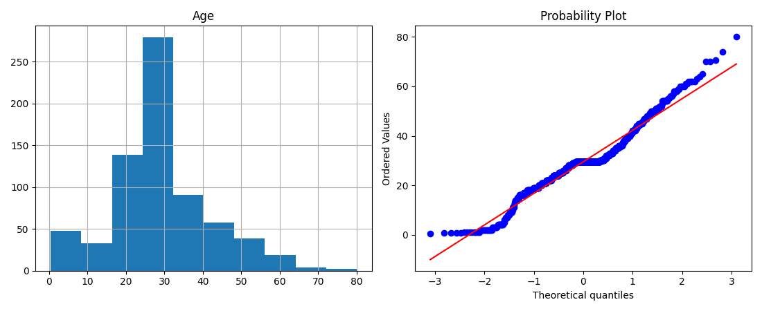
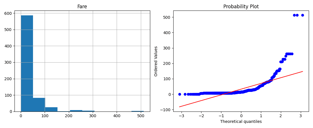
Ageis already fairly close to a bell curve. Not perfect, its Q-Q plot even shows a flat little plateau in the middle, that's the exact rows where the missing values got filled in with the column mean, all landing on the same value at once, but overall it mostly hugs the diagonal line.Fareis heavily right-skewed. This makes intuitive sense: most Titanic passengers paid a modest fare, while a small handful paid a lot for premium tickets, visible as the sharp break of dots at the very top of its Q-Q plot. Its Q-Q plot drifts noticeably away from the line, curving below it at the low end and above it at the high end, the classic signature of a right skew.
That difference matters a lot for what comes next.
Step 2: Establish a Baseline
Before transforming anything, train both a LogisticRegression and a DecisionTreeClassifier on the untouched data, and check the accuracy:
from sklearn.linear_model import LogisticRegression
from sklearn.tree import DecisionTreeClassifier
from sklearn.metrics import accuracy_score

lr = LogisticRegression()
dtc = DecisionTreeClassifier()

lr.fit(X_train, y_train)
dtc.fit(X_train, y_train)

accuracy_score(y_test, lr.predict(X_test))   # roughly 64%
accuracy_score(y_test, dtc.predict(X_test))  # roughly 68.72%
Step 3: Transform Both Columns and Compare
trf = FunctionTransformer(np.log1p)

X_train_transformed = trf.fit_transform(X_train)
X_test_transformed = trf.transform(X_test)

lr.fit(X_train_transformed, y_train)
dtc.fit(X_train_transformed, y_train)
Applying np.log1p to both Age and Fare gives Logistic Regression a small accuracy bump, exactly as expected for a model that's sensitive to distribution shape. Decision Tree's accuracy barely moves, also exactly as expected, since it doesn't care about distribution at all.
Don't trust a single train/test split. A single split can make an improvement look bigger (or smaller) than it really is. Running the same comparison with 10-fold cross-validation (
cross_val_score(model, X, y, cv=10)) confirms the same pattern holds up: Logistic Regression benefits, Decision Tree doesn't.
Step 4: Transform Only the Column That Needs It
Here's the twist worth remembering: transforming Age didn't help, because Age wasn't skewed to begin with. Applying Log to a column that's already close to normal can actually make things slightly worse, not better.
The fix is to only transform Fare, and leave Age alone, using a ColumnTransformer:
from sklearn.compose import ColumnTransformer

trf2 = ColumnTransformer([
    ('log_fare', FunctionTransformer(np.log1p), ['Fare'])
], remainder='passthrough')

X_train_transformed2 = trf2.fit_transform(X_train)
X_test_transformed2 = trf2.transform(X_test)
remainder='passthrough' keeps Age untouched instead of transforming it needlessly. Retraining on this version gives Logistic Regression an even better result than transforming both columns did, since Age is no longer being pushed away from a shape it already had.
A Q-Q plot is the easiest way to confirm this visually, comparing Fare before and after the log transform:
plot_distribution_and_qq(X_train, 'Fare')                       # before
plot_distribution_and_qq(pd.DataFrame(X_train_transformed2, columns=X_train.columns), 'Fare')  # after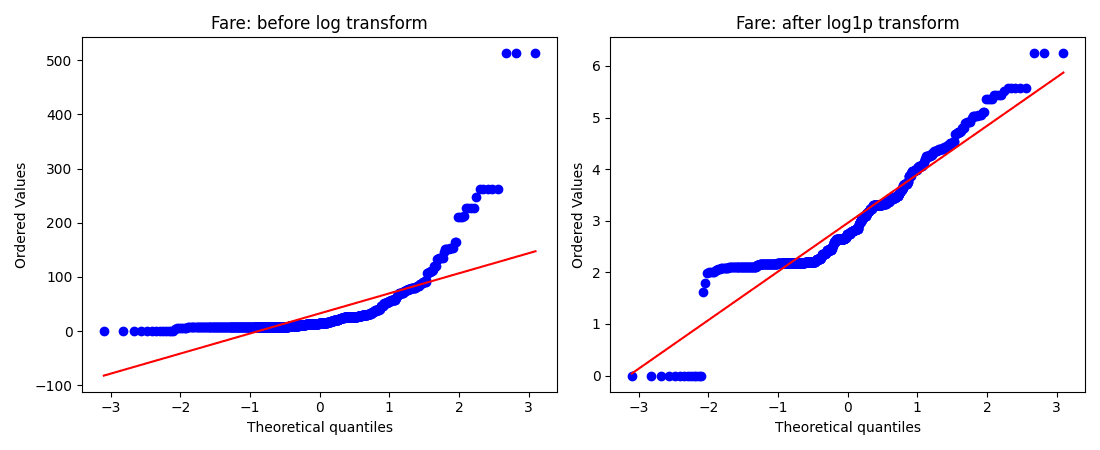
Before the transform, Fare's Q-Q plot curves sharply away from the reference line. After it, the middle of the distribution sits much closer to that diagonal, visual confirmation that the column is genuinely closer to normal, not just that the accuracy number happened to move. The handful of extreme fares at the very top still break away from the line even after the transform, a log doesn't erase outliers entirely, it just shrinks how far they stand out.
Step 5: Compare the Other Transforms
Swapping np.log1p for the other transforms on Fare alone shows how differently each one behaves on the same right-skewed column:
- Reciprocal (
1/x) made accuracy noticeably worse. It's simply the wrong tool for a right-skewed column likeFare. - Square Root (
np.sqrt) gave a small improvement over the untransformed baseline, but nowhere close to what Log achieved. - Square (
x**2) also underperformed Log, unsurprising since Square is meant for left-skewed data, andFareis the opposite.
The Big Takeaway
There's no single formula that works on every dataset. What actually works here is a process:
- Check each numerical column's skew (plot,
skew(), or a Q-Q plot). - Only bother transforming columns that are actually skewed, leave the rest passed through untouched.
- Use Log for right-skewed data and Square for left-skewed data as a starting guess, but Square Root is always worth a quick try too.
- Measure the result with cross-validation, not a single train/test split, before deciding a transform actually helped.
- Remember this whole exercise is irrelevant if you're using a tree-based model.
Summary Cheat Sheet
| Property / Aspect | Detail |
|---|---|
| Used For | Reshaping a skewed numerical column toward a normal distribution |
| Import | sklearn.preprocessing.FunctionTransformer |
| Helps | Statistical models: Linear Regression, Logistic Regression |
| Doesn't Help | Tree-based models: Decision Tree, Random Forest |
| Checking Skew | Distribution plot, .skew(), or (most reliable) a Q-Q plot |
| Right-Skewed Fix | np.log1p (safe with zeros; plain log fails on negatives and zero) |
| Left-Skewed Fix | Square (x**2) |
| Also Worth Trying | Square Root, Reciprocal (1/x, watch for division by zero) |
| Key Best Practice | Transform only the columns that are actually skewed; verify improvement with cross-validation |
What's Next?
In this post, we covered why some models want normally distributed data, how to check whether a column has that shape, and how FunctionTransformer fixes skewed columns with Log, Reciprocal, Square, and Square Root transforms. The next post moves on to Power Transformer, covering two more advanced transforms, Box-Cox and Yeo-Johnson, that go a step further than the simple formulas covered here.