
Ch.4: Assumptions of Linear Regression
Inspired by: YouTube
Ch.1 through Ch.3 covered how linear regression fits a line and how to measure whether it's any good. But a fitted line, and the metrics computed from it, are only trustworthy if the data actually satisfies a handful of conditions linear regression assumes are true. This post covers all five: why each one matters, what breaks when it's violated, and how to check each one in code.
Setup and Source Data
To test these assumptions in Python, we follow the structure of the source notebook. We generate a synthetic regression dataset using scikit-learn with 200 samples and 3 independent continuous features (feature1, feature2, feature3) predicting a continuous target.
import pandas as pd
import numpy as np
import matplotlib.pyplot as plt
import seaborn as sns
from sklearn.datasets import make_regression
from sklearn.model_selection import train_test_split
from sklearn.linear_model import LinearRegression

# Generate synthetic dataset matching notebook structure
X_raw, y_raw = make_regression(n_samples=200, n_features=3, n_informative=3, noise=15, random_state=1)
df = pd.DataFrame(X_raw, columns=['feature1', 'feature2', 'feature3'])
df['target'] = y_raw

X = df.iloc[:, 0:3].values
y = df.iloc[:, -1].values

X_train, X_test, y_train, y_test = train_test_split(X, y, test_size=0.3, random_state=1)

model = LinearRegression()
model.fit(X_train, y_train)

y_pred = model.predict(X_test)
residual = y_test - y_pred
Evaluating the model on the test set yields an score of 0.9531, with learned coefficients [18.89692854, 64.70864512, 35.1871182] and intercept -2.40088535.
Now let us check each of the five assumptions against this dataset.
1. Linear Relationship
What it means
The relationship between each input feature and the target variable must be linear (or approximately linear). In mathematical terms, the expected value of is a linear combination of the input features: .
Why it matters
Ordinary Least Squares (OLS) fits a line (or hyperplane) through the feature space. If the true underlying relationship is non-linear (for example quadratic, exponential, or logarithmic), a straight line will systematically underfit the data. The resulting model will produce biased predictions and poor generalizability.
How to check it
Plot a scatter plot of each individual feature against the target column.
fig, axes = plt.subplots(1, 3, figsize=(15, 4.5), sharey=True)
for i, col in enumerate(['feature1', 'feature2', 'feature3']):
    axes[i].scatter(df[col], df['target'], alpha=0.7, color='#2b5c8f', edgecolors='w', s=40)
    axes[i].set_title(f'{col} vs Target')
    axes[i].set_xlabel(col)
    if i == 0:
        axes[i].set_ylabel('Target')
plt.tight_layout()
plt.show()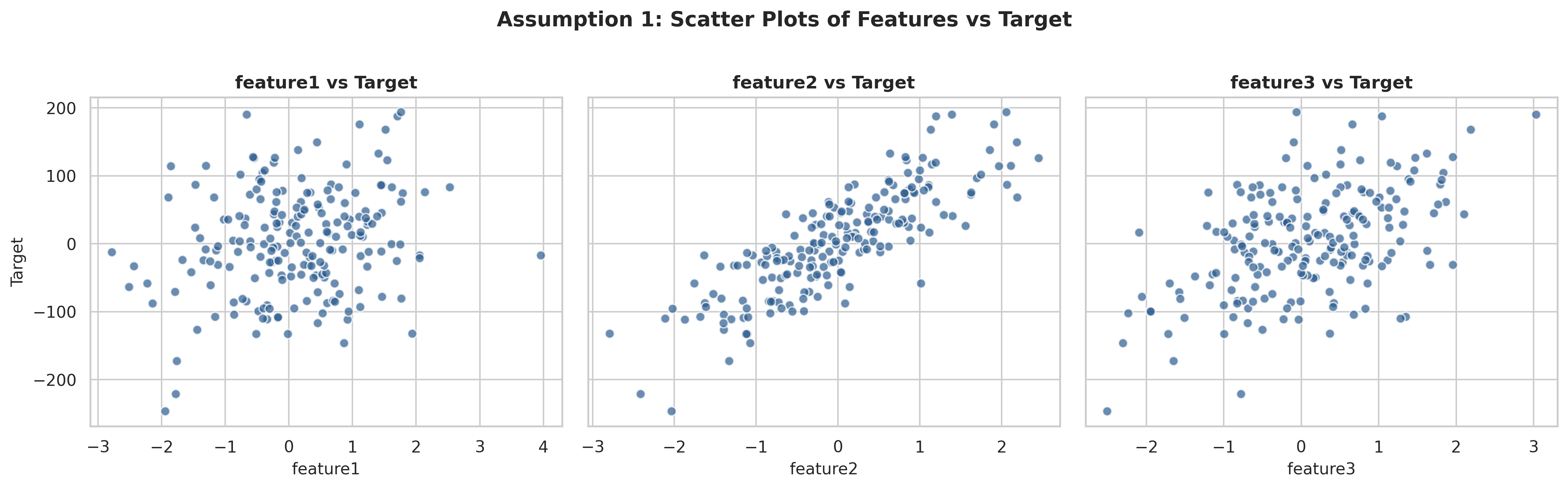
How to interpret the results
In the scatter plots above, as each feature value increases, the target value trends upward linearly without curve patterns or sharp bends. This confirms that all three features share a strong linear relationship with the target variable.
2. No Multicollinearity
What it means
The input features must be independent of one another. Multicollinearity occurs when two or more input features are highly correlated, meaning one feature can be linearly predicted from the others with substantial accuracy.
Why it matters
To understand why multicollinearity is problematic, consider an intuitive analogy: imagine two scientists collaborating on a research project. If scientist A specializes in particle physics and scientist B specializes in organic chemistry, you can easily evaluate their individual contributions to the joint paper. But if both scientists have completely identical skill sets and perform the exact same tasks, it becomes impossible to attribute who contributed what to the outcome.
In linear regression, each coefficient represents the partial derivative of with respect to , holding all other features constant. When two features move together in lockstep, OLS cannot isolate the individual contribution of each feature. The model matrices become ill-conditioned, causing coefficient estimates to become unstable and highly sensitive to tiny fluctuations in the data.
How to check it
There are two complementary techniques to test for multicollinearity:
- Variance Inflation Factor (VIF): VIF measures how much the variance of an estimated regression coefficient is inflated due to collinearity with other features. A VIF value near 1 indicates no collinearity. A VIF value exceeding 5 (or 10) indicates severe multicollinearity that requires feature removal or transformation.
- Correlation Heatmap: A pairwise Pearson correlation matrix between all input features.
from statsmodels.stats.outliers_influence import variance_inflation_factor

# Calculate VIF for each input feature
vif = [variance_inflation_factor(X_train, i) for i in range(X_train.shape[1])]
vif_df = pd.DataFrame({'vif': vif}, index=df.columns[0:3]).T
print(vif_df)
feature1 feature2 feature3
vif 1.004398 1.014349 1.011021
# Plot correlation heatmap between input features
sns.heatmap(df.iloc[:, 0:3].corr(), annot=True, cmap='Blues', fmt=".3f")
plt.title('Feature Correlation Heatmap')
plt.show()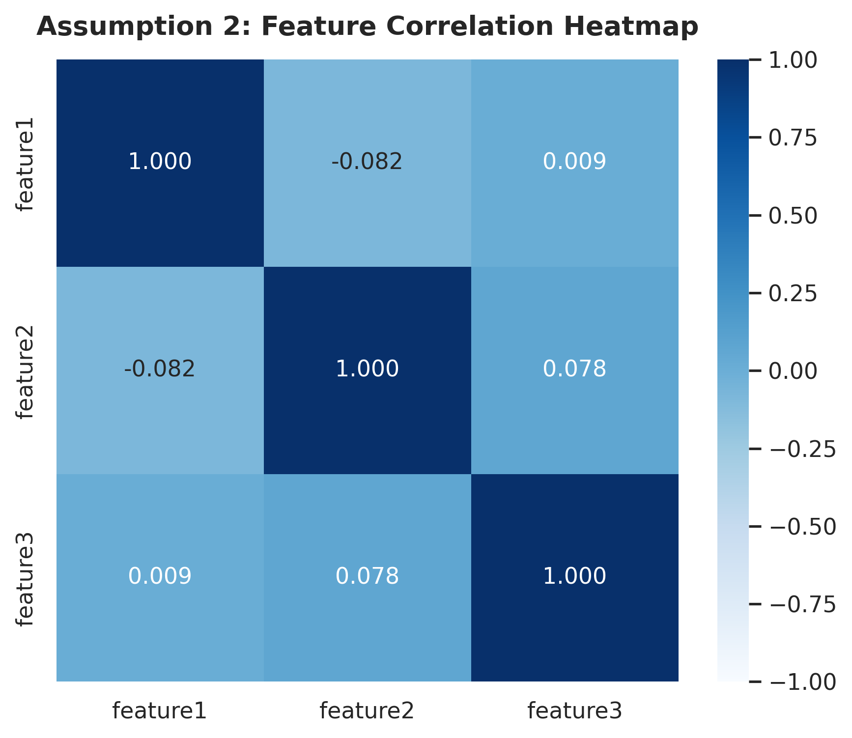
How to interpret the results
The calculated VIF values for feature1, feature2, and feature3 are 1.0044, 1.0143, and 1.0110 respectively, all comfortably close to 1. Furthermore, the correlation heatmap shows pairwise correlations near zero (-0.082, 0.009, and 0.078). This confirms that there is no multicollinearity among the input features.
3. Normality of Residuals
What it means
The residuals (prediction errors ) should be normally distributed with a mean of zero: .
Why it matters
Here's the reassuring part first: even if the residuals aren't normal, the line itself is still fine. The coefficients OLS gives you are still the best possible linear, unbiased estimates, that's what the Gauss-Markov theorem guarantees, and normality has nothing to do with it.
What normality actually affects is how much you can trust the statistics built on top of that line, things like p-values, t-tests, F-tests, and confidence intervals. All of these are ways of asking "how sure are we about this coefficient, really?" and that question is answered by assuming the errors follow a bell curve. If the residuals are badly skewed or come in two separate clumps, those p-values and confidence intervals start lying to you: a coefficient might look statistically significant when it isn't, or a confidence interval might be narrower or wider than it should be.
So in short: non-normal residuals won't wreck your predictions, but they will make you overconfident (or underconfident) about which features actually matter and by how much.
How to check it
We use two complementary visual tools:
- Kernel Density Estimate (KDE) / Histogram: To inspect the shape of the error distribution.
- Q-Q Plot (Quantile-Quantile Plot): Plots sample quantiles against theoretical normal quantiles using
scipy.stats.probplot.
# KDE distribution plot of residuals
sns.histplot(residual, kde=True, stat="density")
plt.title('Distribution of Residuals')
plt.xlabel('Residual')
plt.show()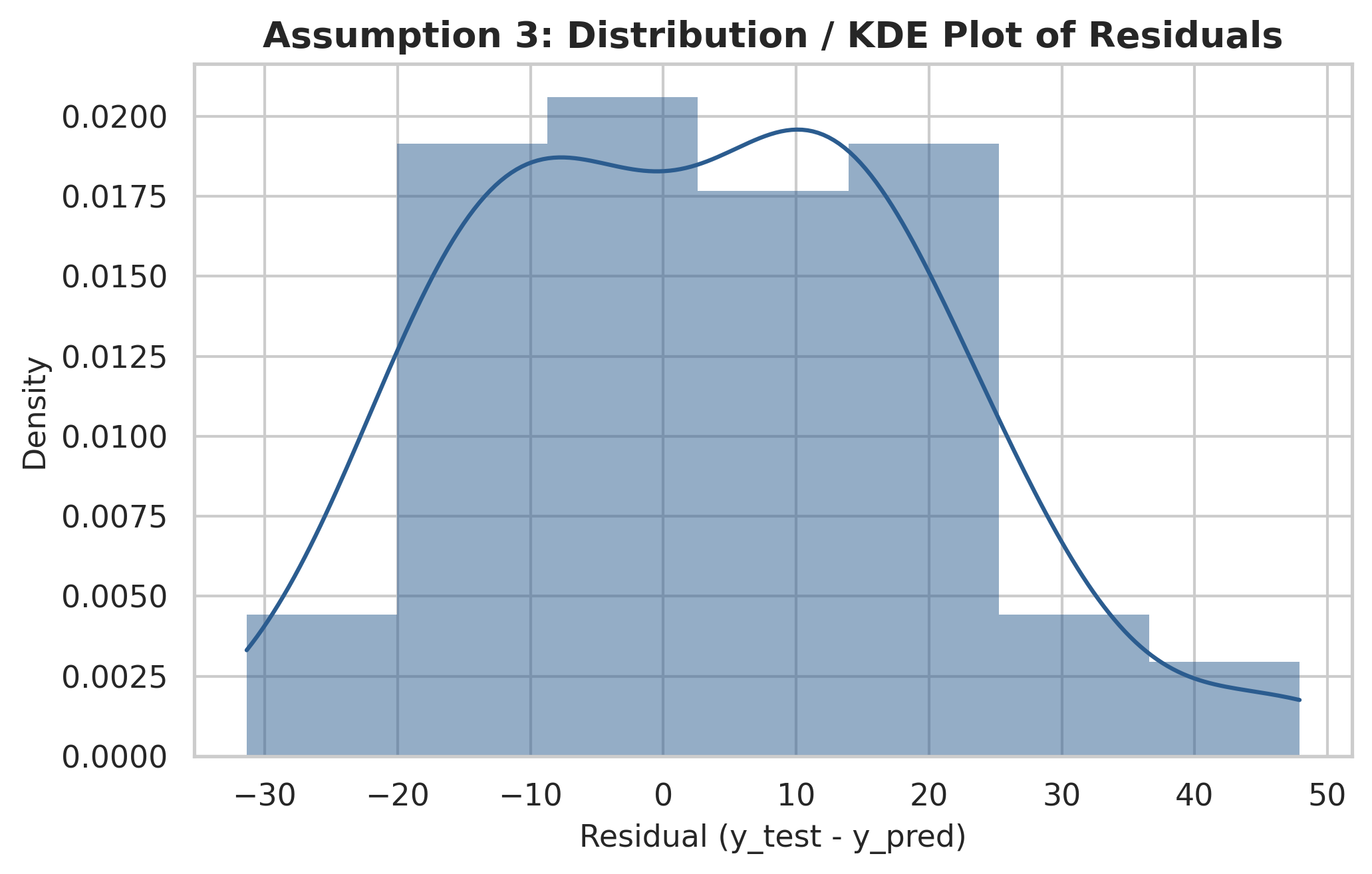
import scipy as sp

# Q-Q plot of residuals
fig, ax = plt.subplots(figsize=(6.5, 5))
sp.stats.probplot(residual, plot=ax, fit=True)
plt.title('Q-Q Plot of Residuals')
plt.show()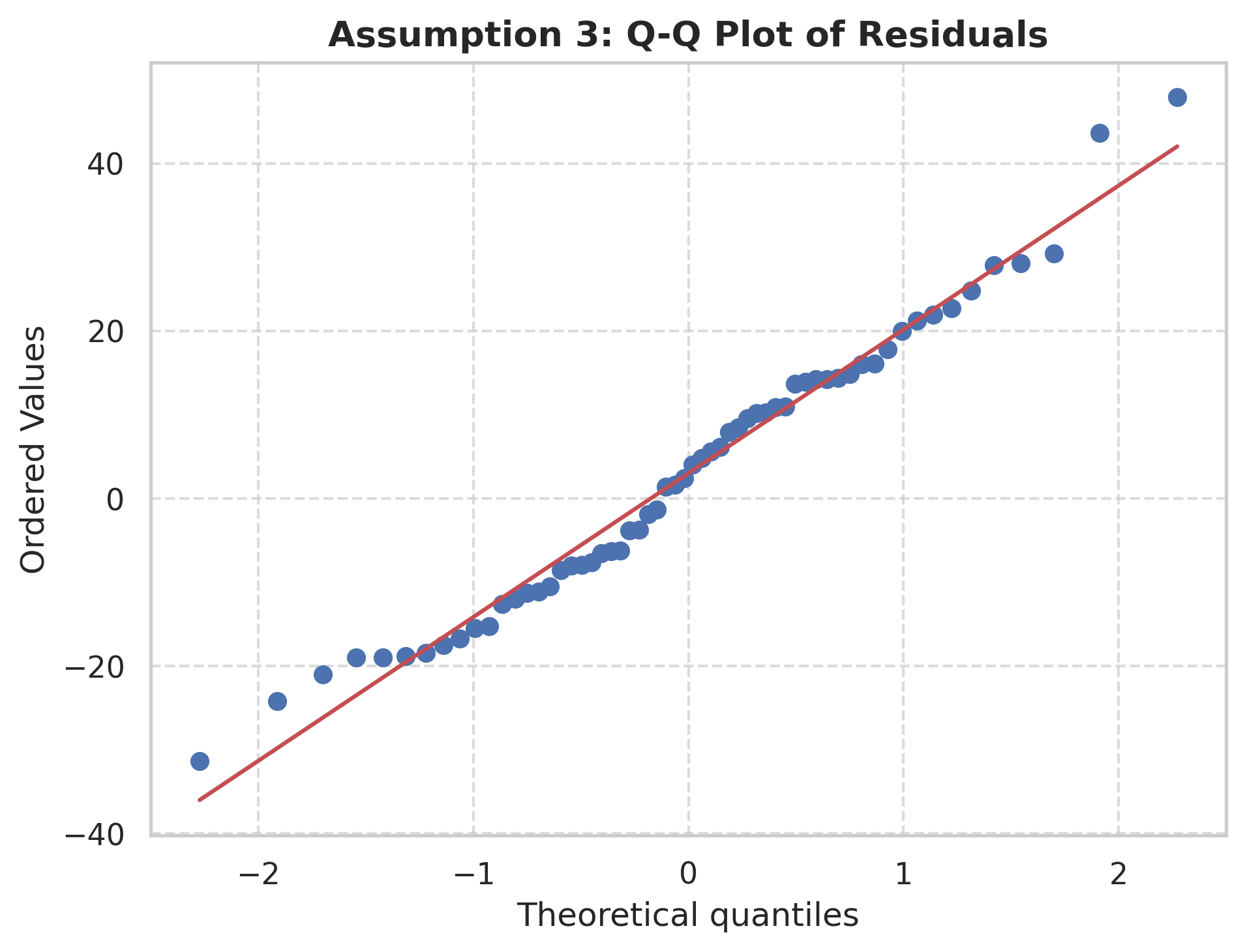
How to interpret the results
In the KDE plot, the residuals form a symmetrical, bell-shaped distribution centered around 0. In the Q-Q plot, the data points closely track the red 45-degree reference line with only minor deviations at the extreme tails. Both visualizations confirm that the residuals satisfy the normality assumption.
4. Homoscedasticity
What it means
"Homo" means same, and "scedasticity" means spread. Homoscedasticity requires that the variance of the residuals remains constant across all values of the predicted output .
Not the same check as normality: Point 3 asks whether the residuals, pooled together, are shaped like a bell curve. Point 4 asks whether the size of that spread stays constant across the range of . A model can pass one and fail the other, residuals can be normally distributed near every value of while still growing wider as increases (heteroscedastic), or stay a constant width everywhere while being skewed rather than bell-shaped (non-normal). They're independent checks, not restatements of each other.
Why it matters
Homoscedasticity is really about whether the model is equally trustworthy everywhere, or great in some spots and shaky in others.
Picture predicting house prices. For houses under $200k, the model might be consistently off by about $2,000. For houses over $2 million, it might sometimes be off by $2,000 and sometimes by $200,000, wildly inconsistent. That's heteroscedasticity: the size of the error depends on where you are in the data, instead of staying roughly constant everywhere.
The formulas OLS uses to say "here's how confident you should be in this coefficient" (standard errors, confidence intervals, p-values) all assume the errors are roughly the same size everywhere. It's like calculating a margin of error assuming every measurement came from the same precise scale, when actually some came from a shaky bathroom scale. Because OLS can't tell its confidence should differ region by region, it ends up reporting confidence intervals and p-values that look tighter and more significant than the data actually supports. So the predictions themselves aren't necessarily wrong, but the "how sure are we" numbers that come with them can't be trusted.
How to check it
Plot a scatter plot of predicted values (y_pred) on the x-axis against residuals (residual) on the y-axis, along with a reference line at residual = 0.
# Predicted values vs Residuals scatter plot
plt.scatter(y_pred, residual, alpha=0.7)
plt.axhline(0, color='red', linestyle='--')
plt.xlabel('Predicted Values')
plt.ylabel('Residuals')
plt.title('Predicted Values vs Residuals')
plt.show()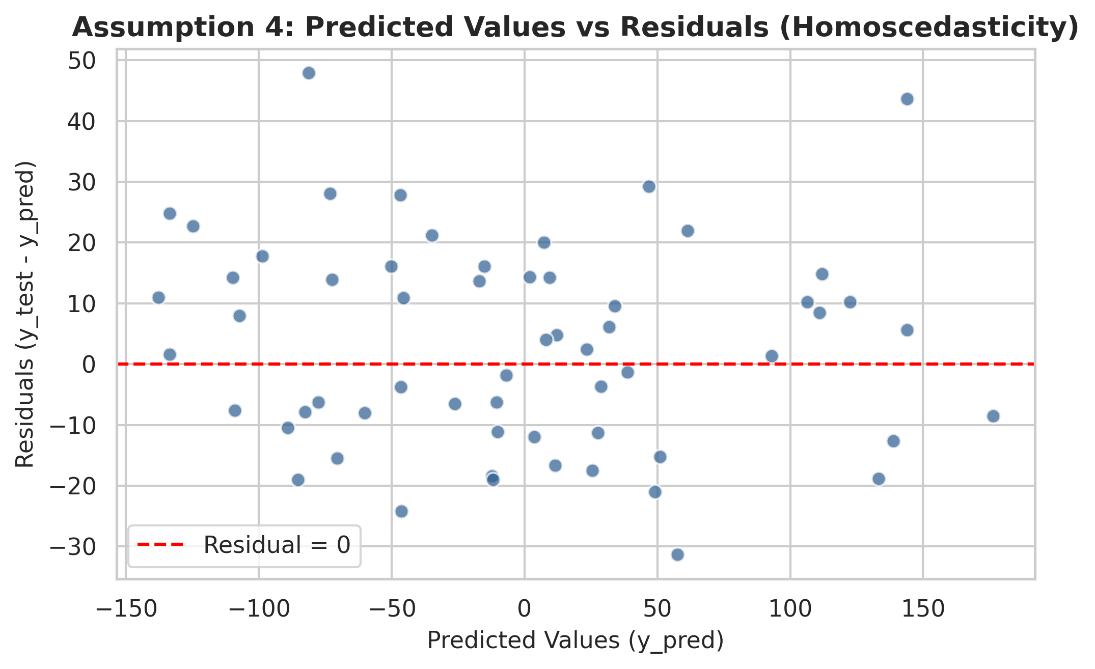
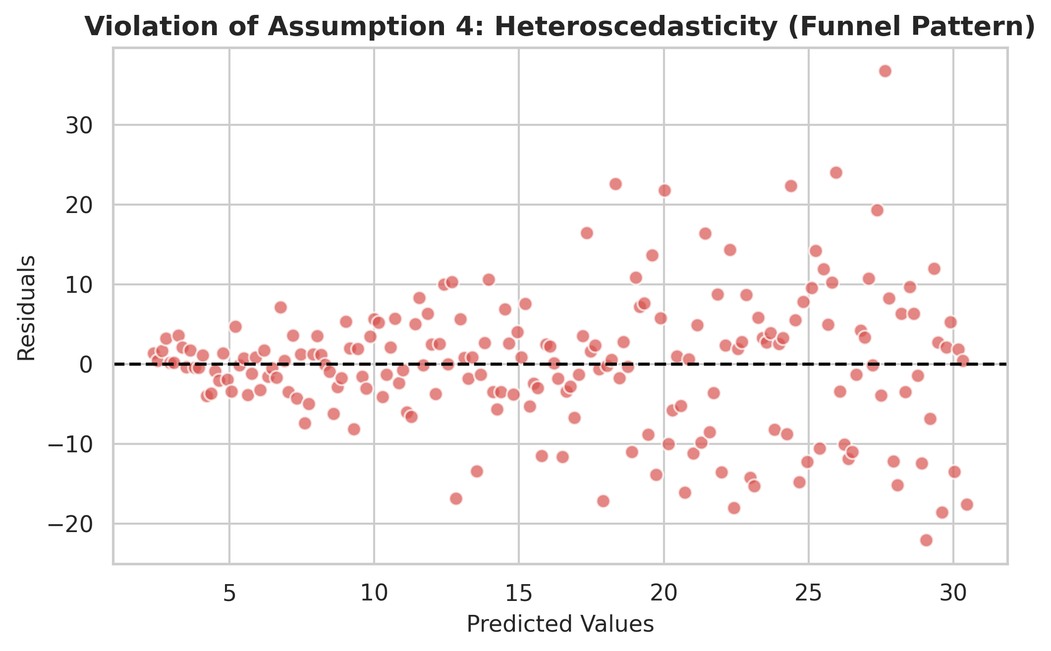
To understand what a violation looks like, compare the well-behaved plot above with a heteroscedastic dataset where noise variance scales directly with the feature size:
How to interpret the results
In the model plot, the residuals form a uniform, rectangular band of random scatter across all predicted values without any expanding or contracting patterns. In contrast, the heteroscedastic example exhibits a distinct funnel or cone shape where residual spread widens as increases. Our model satisfies homoscedasticity.
5. No Autocorrelation of Residuals
What it means
Knowing the error on one observation should tell you nothing about the error on another. Autocorrelation is a violation of that: it means residuals are correlated with each other in some systematic order, most commonly with their neighbors in time, so the error term at one point, , is correlated with the error term just before it, . If you plotted residuals in sequence and saw runs of consecutive positive values followed by runs of consecutive negative values (rather than a random up-down scatter), that's autocorrelation showing up visually.
Why it matters
Picture a model predicting your daily spending that was never given a weekend flag as an input. Every Saturday it undershoots, because that's when you eat out more, and Sunday undershoots for the same reason, that Saturday miss and that Sunday miss aren't independent accidents, they're both driven by the same unmodeled cause sitting right next to each other in the sequence. Then Monday through Friday, the model is roughly on target again. That block of two consecutive underpredictions followed by five accurate days is autocorrelation: the error at one point is correlated with the error right next to it, because whatever the model is missing (here, weekend behavior) doesn't just vanish between rows, it persists across the whole block where its cause is present.
The problem is that OLS's standard error formula treats every row as a fresh, independent piece of evidence, and more independent rows is exactly what shrinks a standard error. But Saturday's error and Sunday's error above aren't two independent pieces of evidence, they're both just echoes of the same missing weekend effect. So the data secretly contains less independent information than its row count suggests. OLS has no way of knowing that: it plugs in the full row count regardless, and treating correlated rows as if they were independent makes the reported standard errors smaller than they really should be.
Smaller standard errors make confidence intervals narrower and p-values look more significant than they actually are. In practice, you end up more confident about your coefficients than you have any right to be; you might conclude a feature is meaningfully predictive when really you're just looking at a pattern the model failed to capture.
How to check it
Plot the residuals in sequential observation order (row index order).
# Residuals plotted in row order
plt.plot(residual, marker='o', linestyle='-')
plt.axhline(0, color='red', linestyle='--')
plt.xlabel('Observation Index')
plt.ylabel('Residual')
plt.title('Residuals in Row Order')
plt.show()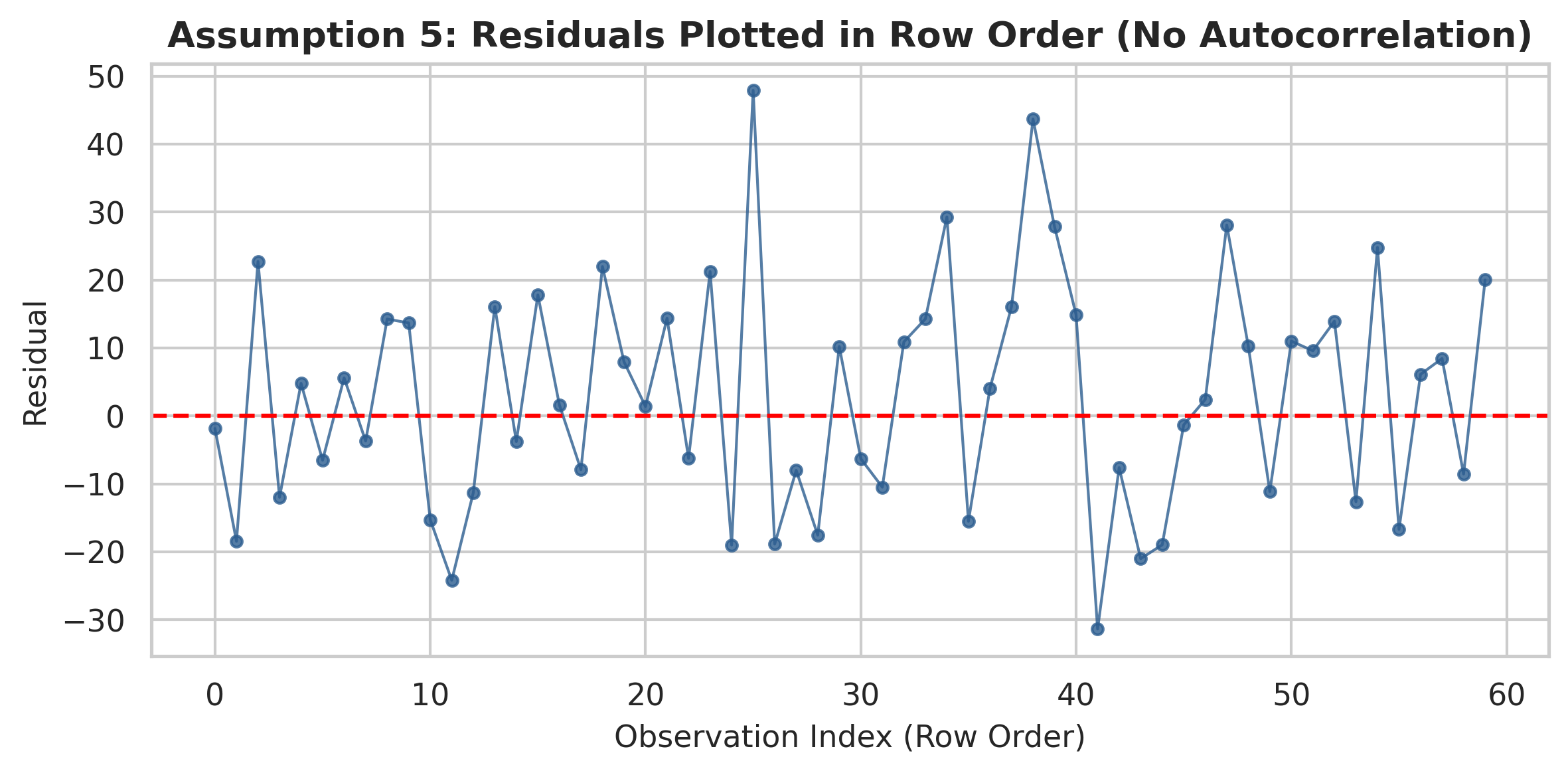
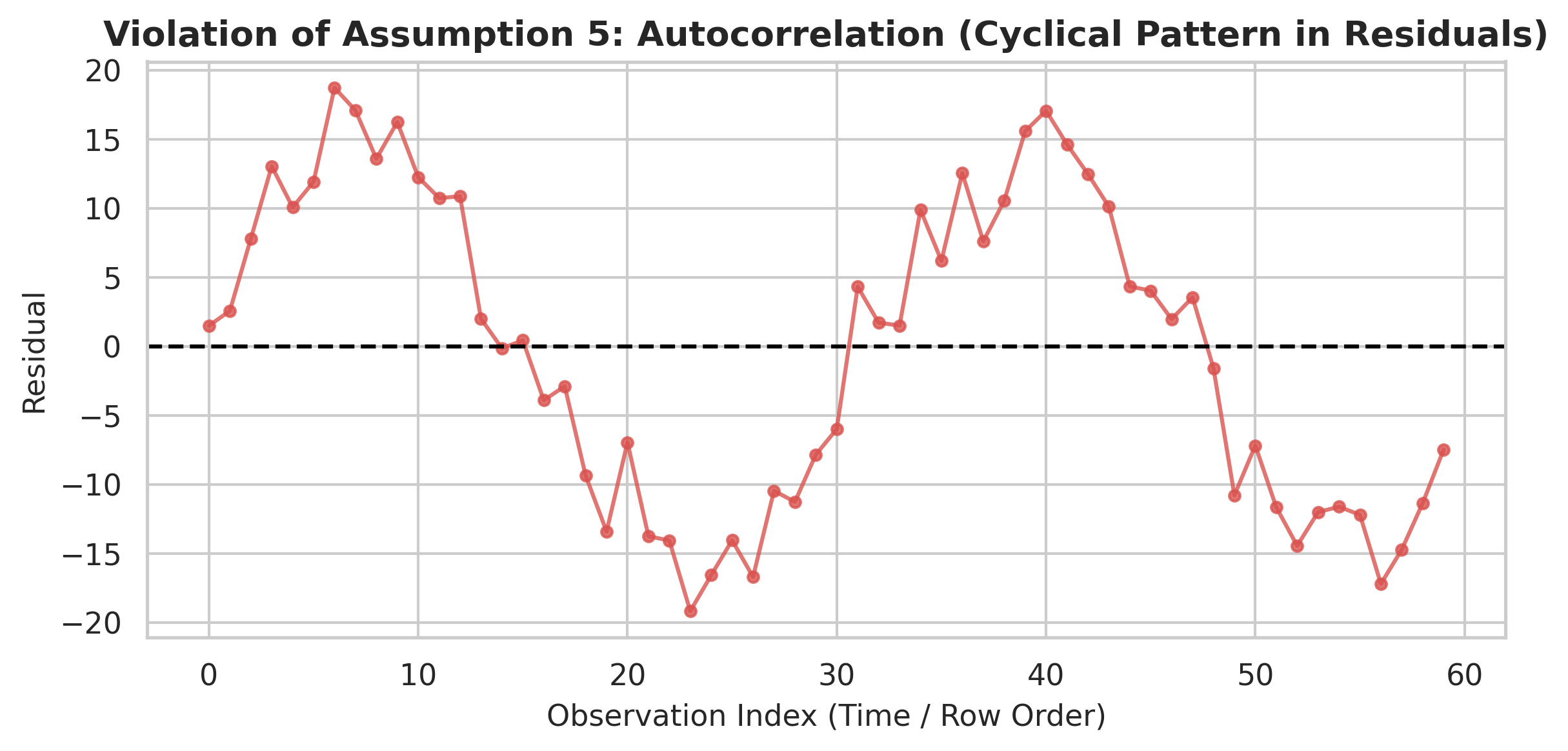
To illustrate what a violation looks like, compare the random pattern above with a dataset exhibiting strong autocorrelation (such as a cyclical trend in residuals over time):
How to interpret the results
In the model plot, residuals bounce randomly above and below zero across observation indices without any recognizable trend or wave. In contrast, the bad example displays a smooth, wave-like pattern where positive residuals cluster together followed by negative residuals. This confirms that our model residuals exhibit no autocorrelation.
Summary Checklist
| Assumption | Diagnostic Tool | Desired Outcome |
|---|---|---|
| 1. Linear Relationship | Scatter plot of feature vs target | Straight linear trend |
| 2. No Multicollinearity | VIF and Correlation Heatmap | VIF , correlation near 0 |
| 3. Normality of Residuals | KDE plot and Q-Q plot | Bell-shaped curve, points along Q-Q diagonal |
| 4. Homoscedasticity | Residuals vs Predicted scatter | Uniform spread band (no funnel shape) |
| 5. No Autocorrelation | Residuals in row order plot | Random noise (no cyclical pattern) |
What's Next
These five assumptions apply to simple linear regression already, and they matter even more once there's more than one input column. Ch.5 picks that up next: extending the line into a plane (or hyperplane) when there's more than one input feature.