
Ch.3: Regression Metrics - MAE, MSE, RMSE, R² and Adjusted R²
Inspired by: YouTube
The previous post derived the closed-form OLS solution and coded a linear regression class from scratch. Both paths produced the same m and b, which is reassuring, but it doesn't answer a more basic question: is the line they produce actually any good? Having a slope and an intercept means nothing if the predictions are wildly off. This post covers the five standard metrics used to judge a regression model, what each one actually measures, what makes each one useful, and what makes each one fall short.
Why Metrics Matter
Suppose you fit a regression line to some data and start making predictions. Some predictions land close to the actual values, some don't. You need a single number that summarizes how wrong the model is overall, so you can compare models, tune hyperparameters, or just answer the question "is this model good enough?" That single number is a metric. There's no one perfect metric, which is why there are five commonly used ones: MAE, MSE, RMSE, R², and adjusted R².
Setup
Same placement dataset as the previous two posts: 200 students, cgpa predicting package. The code below matches the source notebook for this topic.
import pandas as pd
import numpy as np
import matplotlib.pyplot as plt
from sklearn.model_selection import train_test_split
from sklearn.linear_model import LinearRegression

df = pd.read_csv('placement.csv')

X = df.iloc[:, 0:1]
y = df.iloc[:, -1]

X_train, X_test, y_train, y_test = train_test_split(X, y, test_size=0.2, random_state=2)

lr = LinearRegression()
lr.fit(X_train, y_train)

y_pred = lr.predict(X_test)
Now y_test holds the actual packages for 40 test students, and y_pred holds what the model predicted for them. Every metric below boils down to comparing these two arrays, point by point.
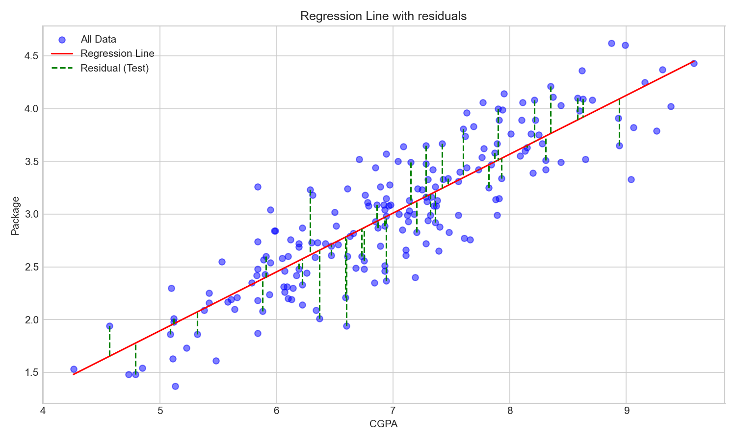
The green dashed lines are the residuals: the vertical distance between each test point and the regression line. Every metric below is a different way of summarizing those gaps into a single number.
MAE (Mean Absolute Error)
The simplest idea: for each point, measure how far off the prediction was (ignoring sign), then average those distances.
Geometrically, MAE is the average absolute vertical distance between each point and the regression line. If MAE is zero, the line passes through every point exactly.
from sklearn.metrics import mean_absolute_error

print("MAE", mean_absolute_error(y_test, y_pred))
MAE 0.2884710931878175
Advantages:
- The result is in the same unit as the output column. If
packageis in LPA, then MAE = 0.29 means the model is off by 0.29 LPA on average. That's easy to communicate to someone who doesn't know ML: "our model's average error is about 0.29 LPA." - It's relatively robust to outliers compared to MSE. A single wildly wrong prediction increases MAE linearly, not quadratically.
Disadvantages:
- The absolute value function
|x|is not differentiable at zero. This is the biggest practical problem with MAE. Many optimization techniques (like gradient descent) need to differentiate the loss function to find the minimum. The non-differentiable point at zero makes MAE harder to use directly as a loss function for gradient-based optimizers. This limitation is exactly why MSE exists.
MSE (Mean Squared Error)
Instead of taking the absolute value of each error, square it.
Geometrically, if you imagine drawing a square on each residual line (with side length equal to the error), MSE is the average area of those squares. The optimizer is trying to minimize the total area.
from sklearn.metrics import mean_squared_error

print("MSE", mean_squared_error(y_test, y_pred))
MSE 0.12129235313495527
Advantages:
- Fully differentiable everywhere. Squaring is a smooth function with no kinks, so gradient-based optimizers can work with it without issues. This is why MSE (or half of MSE) is the standard loss function that optimizers minimize. It ties directly back to the cost function from Ch.2: the
E = Σ(yᵢ - mxᵢ - b)²that was minimized to derive the OLS closed-form solution is justn × MSE.
Disadvantages:
- The output unit is squared. If package is in LPA, MSE is in LPA². An MSE of 0.12 doesn't immediately tell you how many LPA the model is off by. You'd have to take a square root to get back to the original unit, which motivates RMSE.
- It heavily penalizes outliers. Because errors are squared, a single prediction that's off by 5 contributes 25 to the sum, while a prediction off by 1 contributes only 1. One badly predicted point can dominate the entire metric, which can mislead you if your data has a few outlier rows.
RMSE (Root Mean Squared Error)
Just take the square root of MSE.
print("RMSE", np.sqrt(mean_squared_error(y_test, y_pred)))RMSE 0.34827051717731616
Advantages:
- Back in the original unit. RMSE = 0.35 LPA is just as easy to interpret as MAE = 0.29 LPA. You get the interpretability of MAE while keeping most of MSE's mathematical properties (still differentiable).
Disadvantages:
- Still relatively sensitive to outliers, just less extreme than raw MSE since the square root compresses large values.
Which One to Use?
In practice, people often compute all three (MAE, MSE, RMSE) side by side rather than picking one dogmatically. Which one "fits" best depends on the dataset, particularly on how many outliers it has and how important it is to penalize large errors. When you need to pick one as a loss function for an optimizer, MSE is almost always the default because it's differentiable. But for reporting and communicating results, MAE or RMSE (both in the original unit) tend to be more useful.
R² (Coefficient of Determination)
MAE, MSE, and RMSE all tell you how much error the model makes, but those numbers are hard to judge in isolation. Is an MAE of 0.29 good or bad? It depends entirely on the range and variance of the output column. An MAE of 0.29 might be great for a column that ranges from 1 to 100, but terrible for one that ranges from 0 to 1.
R² solves this by measuring how good the model is relative to the simplest possible baseline: just predicting the mean of y for every input. If you had no input column at all, the best you could do is predict ȳ (the mean package) for every student. R² measures how much better your actual regression line is than that naive strategy.
where:
- SSres =
Σ(yᵢ - ŷᵢ)²is the sum of squared errors from your regression line's predictions. - SStotal =
Σ(yᵢ - ȳ)²is the sum of squared errors from the mean line's "predictions" (justȳevery time).
Intuitively: SStotal is how badly the naive mean-baseline does. SSres is how badly your actual regression line does. The ratio SSres/SStotal tells you what fraction of the baseline error your model still has. Subtract that from 1 and you get the fraction your model managed to eliminate.
from sklearn.metrics import r2_score

print("R²", r2_score(y_test, y_pred))
R² 0.780730147510384
How to Interpret R²
- R² = 1: SSres = 0, meaning the regression line passes through every point perfectly. Zero residual error. This is the theoretical best.
- R² = 0: SSres = SStotal, meaning the regression line is doing exactly as poorly as just predicting the mean every time. Having the input column (cgpa) didn't help at all. The model is useless.
- 0 < R² < 1: The normal range. Higher is better.
There's another common way to read R²: R² = 0.78 means "78% of the variance in y (package) is explained by the input column(s) (cgpa)." The remaining 22% is unexplained variance, caused by factors the model doesn't know about: interview performance, company policy, negotiation skills, luck.
If you had more input columns, say cgpa plus iq, and R² was still 0.78, then 78% of the variance in package is explained by cgpa and iq together.
This interpretation is powerful because it's context-independent. Unlike MAE/MSE/RMSE (where the number's meaning depends on what your y column is and what scale it's on), R² always sits on a 0-to-1 scale (in the normal case). An R² of 0.95 is good regardless of whether you're predicting salaries, temperatures, or stock prices.
Can R² Be Negative?
Yes. R² goes negative when SSres > SStotal, meaning your regression line is doing worse than just predicting the mean every time. This can happen when you apply a linear model to clearly non-linear data, or when you evaluate a model on data it was never meant to generalize to.
# Create non-linear data: a sine wave
np.random.seed(42)
x_nl = np.linspace(0, 2 * np.pi, 100)
y_nl = 5 * np.sin(x_nl) + np.random.normal(0, 0.5, 100)

# Fit only on the rising half, predict on the falling half
mid = 50
lr_nl = LinearRegression()
lr_nl.fit(x_nl[:mid].reshape(-1, 1), y_nl[:mid])
y_pred_nl = lr_nl.predict(x_nl[mid:].reshape(-1, 1))

print("R²", r2_score(y_nl[mid:], y_pred_nl))
R² -14.3456
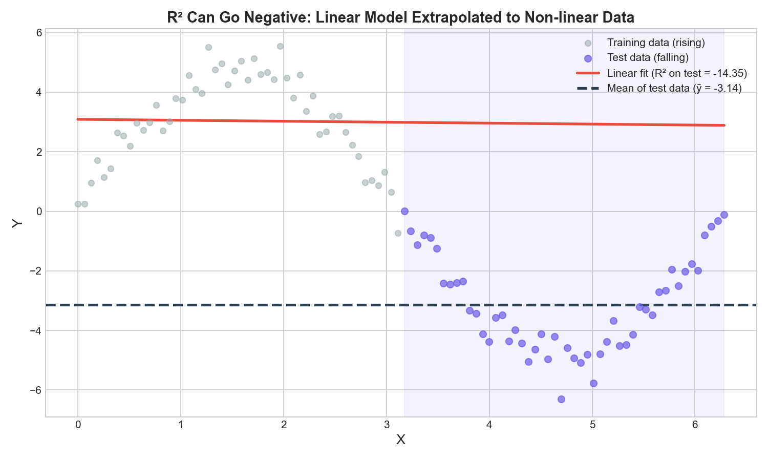
The linear model learned an upward trend from the rising portion of the sine wave and keeps predicting high values. But the test data falls sharply downward. The red line (linear fit) is far above almost every purple test point, while the black dashed mean line sits much closer. The model is doing far worse than just predicting the mean, so R² = -14.35, deeply negative. If you see negative R², it's a clear signal that either the model type is wrong for the data (e.g. linear model on non-linear data) or the model is being evaluated on data from a completely different distribution than what it was trained on.
The Problem with R²
R² has a fundamental flaw: it can never decrease when you add more input columns, even completely useless ones. Adding a column either keeps R² flat or nudges it up, never down.
Think about why. When you add a column, the optimizer has an extra degree of freedom: it can set that column's coefficient to whatever value minimizes the squared error best. Even if the column is pure noise (like a random number column, or "temperature on the day of the interview"), the optimizer might still find a tiny accidental correlation in the training data and squeeze out a tiny SSres reduction. SSres goes down (or stays the same), SStotal doesn't change, so R² goes up (or stays the same).
This means R² alone can mislead you into thinking more features always help, when really you might be adding junk columns that only create the illusion of a better model.
# Demonstrate: add a random column, check R² on training data
np.random.seed(0)
df['random_feature'] = np.random.random(200)

X2 = df[['cgpa', 'random_feature']]
X2_train, X2_test, y_train2, y_test2 = train_test_split(X2, y, test_size=0.2, random_state=2)

lr2 = LinearRegression()
lr2.fit(X2_train, y_train2)
y_pred_train2 = lr2.predict(X2_train)

r2_one_col = r2_score(y_train, lr.predict(X_train))
r2_two_col = r2_score(y_train2, y_pred_train2)

print(f"R² with cgpa only:           {r2_one_col:.6f}")
print(f"R² with cgpa + random noise: {r2_two_col:.6f}")
R² with cgpa only: 0.773311
R² with cgpa + random noise: 0.776327
R² went up slightly despite the second column being pure noise. On training data, it can never go down.
Adjusted R²
Adjusted R² fixes this by explicitly penalizing the addition of columns that don't pull their weight.
where n is the number of rows and k is the number of input columns.
The formula works like this: when you add a useless column, k increases. Holding R² roughly flat (since the useless column barely improves it), the (n - 1) / (n - k - 1) ratio increases, which makes the whole second term larger, which drives adjusted R² down. But when you add a genuinely informative column, R² increases enough that adjusted R² still goes up, because the R² improvement more than compensates for the larger k.
n = len(y_test)

# With cgpa only (k=1)
r2 = r2_score(y_test, y_pred)
adj_r2 = 1 - ((1 - r2) * (n - 1) / (n - 1 - 1))
print(f"R²:          {r2:.4f}")
print(f"Adjusted R²: {adj_r2:.4f}")
R²: 0.7807
Adjusted R²: 0.7750
The gap between R² (0.7807) and adjusted R² (0.7750) is small here because there's only one input column. Does adding useless columns actually push it down? Piling on random noise columns one at a time on the training data shows the honest picture:
np.random.seed(0)
for k_extra in [0, 1, 5, 10]:
    dfx = df[['cgpa']].copy()
    for i in range(k_extra):
        dfx[f'noise_{i}'] = np.random.random(len(df))

    Xn_train, Xn_test, yn_train, yn_test = train_test_split(dfx, y, test_size=0.2, random_state=2)
    lrn = LinearRegression()
    lrn.fit(Xn_train, yn_train)

    r2n = r2_score(yn_train, lrn.predict(Xn_train))
    n_rows, k_cols = Xn_train.shape
    adj_r2n = 1 - ((1 - r2n) * (n_rows - 1) / (n_rows - k_cols - 1))
    print(f"{k_extra} noise columns -> R²: {r2n:.5f}  Adjusted R²: {adj_r2n:.5f}")
0 noise columns -> R²: 0.77331 Adjusted R²: 0.77188
1 noise columns -> R²: 0.77633 Adjusted R²: 0.77348
5 noise columns -> R²: 0.77837 Adjusted R²: 0.76968
10 noise columns -> R²: 0.78459 Adjusted R²: 0.76858
With just one noise column, adjusted R² actually ticks up slightly too, 160 training rows is a small enough sample that pure chance can hand the model a tiny accidental correlation big enough to outweigh the penalty for one extra column. But keep adding noise columns and the pattern flips: R² keeps climbing (0.773 → 0.785, it never has any other option), while adjusted R² peaks early and then trends back down (0.772 → 0.769), because the accumulating penalty for useless columns eventually overtakes the accumulating (fake) R² gains. A big or growing gap between R² and adjusted R² is the signal that R² is being inflated by columns that aren't really pulling their weight. Always compute both, especially when working with multiple linear regression and lots of input columns.
Computing All Metrics with sklearn
Bringing it all together, here's the complete metrics computation for this model. The imports and metric functions match the source notebook exactly:
from sklearn.metrics import mean_absolute_error, mean_squared_error, r2_score

y_pred = lr.predict(X_test)

print("MAE", mean_absolute_error(y_test, y_pred))
print("MSE", mean_squared_error(y_test, y_pred))
print("RMSE", np.sqrt(mean_squared_error(y_test, y_pred)))
print("R²", r2_score(y_test, y_pred))

# Adjusted R²
r2 = r2_score(y_test, y_pred)
n = X_test.shape[0]
k = X_test.shape[1]
adj_r2 = 1 - ((1 - r2) * (n - 1) / (n - k - 1))
print("Adjusted R²", adj_r2)
MAE 0.2884710931878175
MSE 0.12129235313495527
RMSE 0.34827051717731616
R² 0.780730147510384
Adjusted R² 0.7749598882343415
For this model on this dataset: the average prediction is off by about 0.29 LPA (MAE), and the model explains about 78% of the variance in package using cgpa alone (R²). Not perfect, but not bad for a single-variable linear model on noisy real-world data.
What's Next
These five metrics give you the tools to judge whether a regression line is any good, and which pitfalls to watch for (outlier sensitivity with MSE, R² inflation with useless columns). Before moving on to multiple input columns, the next post steps back and covers the assumptions linear regression relies on: the conditions that need to roughly hold for the line, and the metrics computed from it, to actually be trustworthy.